Undoubtedly, the Premier League is at the forefront of global football today. Top managers, fantastic players, and a fan base reaching more or less every corner of the world. To keep these fans engaged and informed, the Premier League clubs constantly post graphics on their social platforms throughout the year, especially on matchday.
Here at Kickly, we live and breathe sports all day long. That’s why we decided to review each of the Premier League teams in turn and rank their matchday social media graphics for this season.
The criteria is simple. We will assess the clubs according to the following parameters:
- Ease of understanding: The designs are intuitive, and the information presented is easy to comprehend.
- Brand identity: The club’s identity should be instantly recognizable in all graphics posted on social media.
- Creativity – Graphics are memorable, embody unique ideas, and exhibit masterful execution.
A total of 15 points are available for each team, five for each category. The matchday posts we will assess are: Next Match, Lineup, Substitutions, Goals, Full Time Score & the Man of the Match. Let’s see how Premier League teams fare on our table of matchday graphics. Let the game begin!
Arsenal
Aston Villa
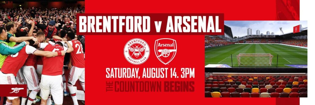
Brentford
Brighton & Hove Albion
Burnley
Chelsea
Crystal Palace
Everton
Leeds United
Leicester City
Liverpool
Manchester City
Manchester United
Newcastle United
Norwich City
Southampton
Tottenham Hotspur
Watford
West Ham United
Wolverhampton Wanderers
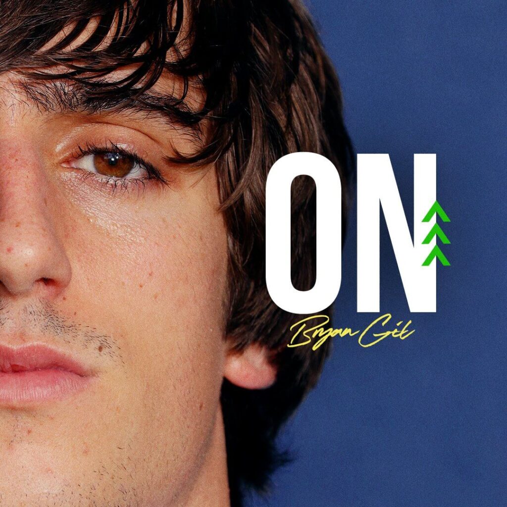
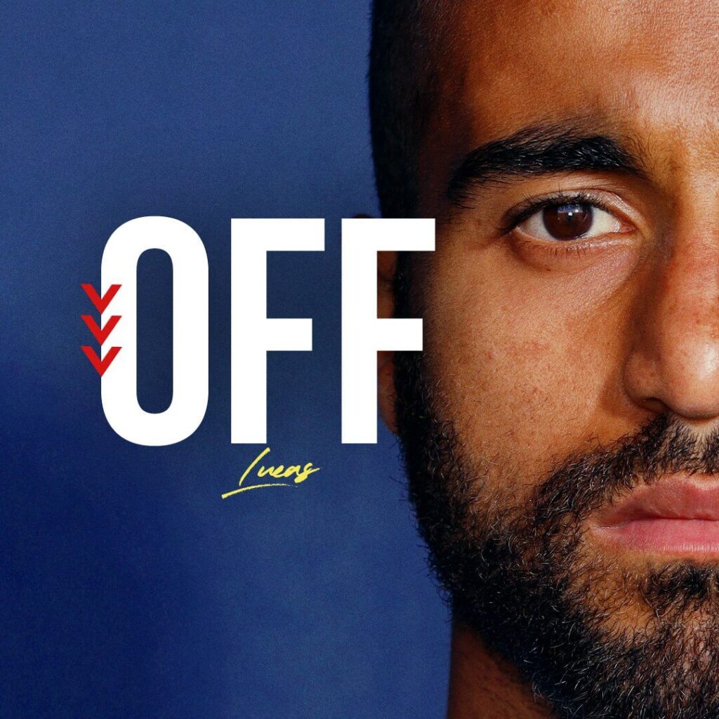
Get access to 75 Free Matchday Templates
Arsenal – Matchday Graphics
Arsenal’s Match Day Announcement and the Full Time score-card stands out amongst their visuals. Their Full Time score graphic not only shows the relevant match image and the scoreline, but also shows the goalscorers and the associated times of the goals. The backgrounds use subtle elements with the bright and darker shades of red of the Arsenal.
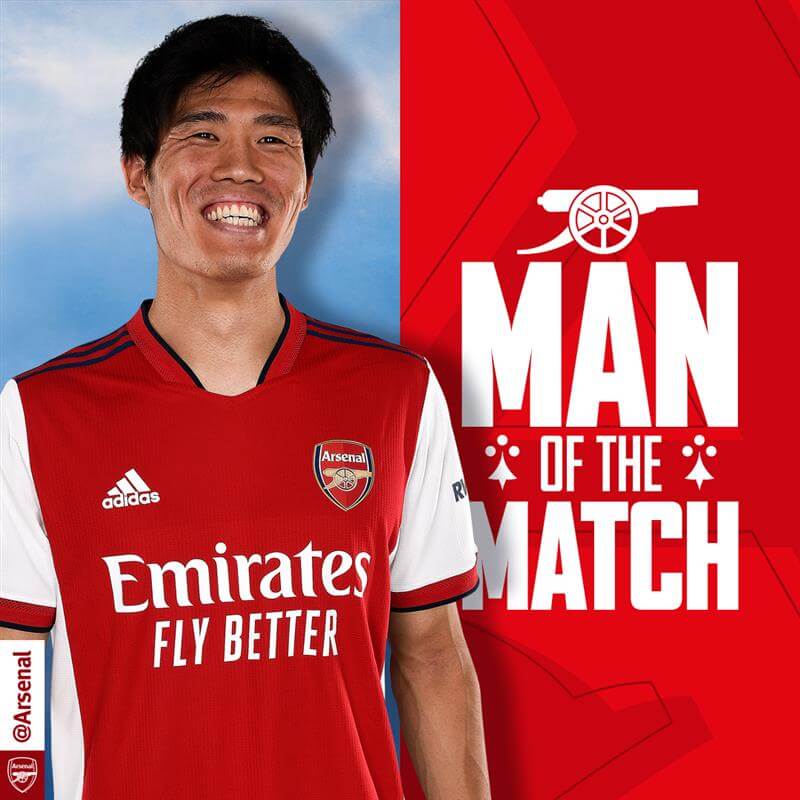
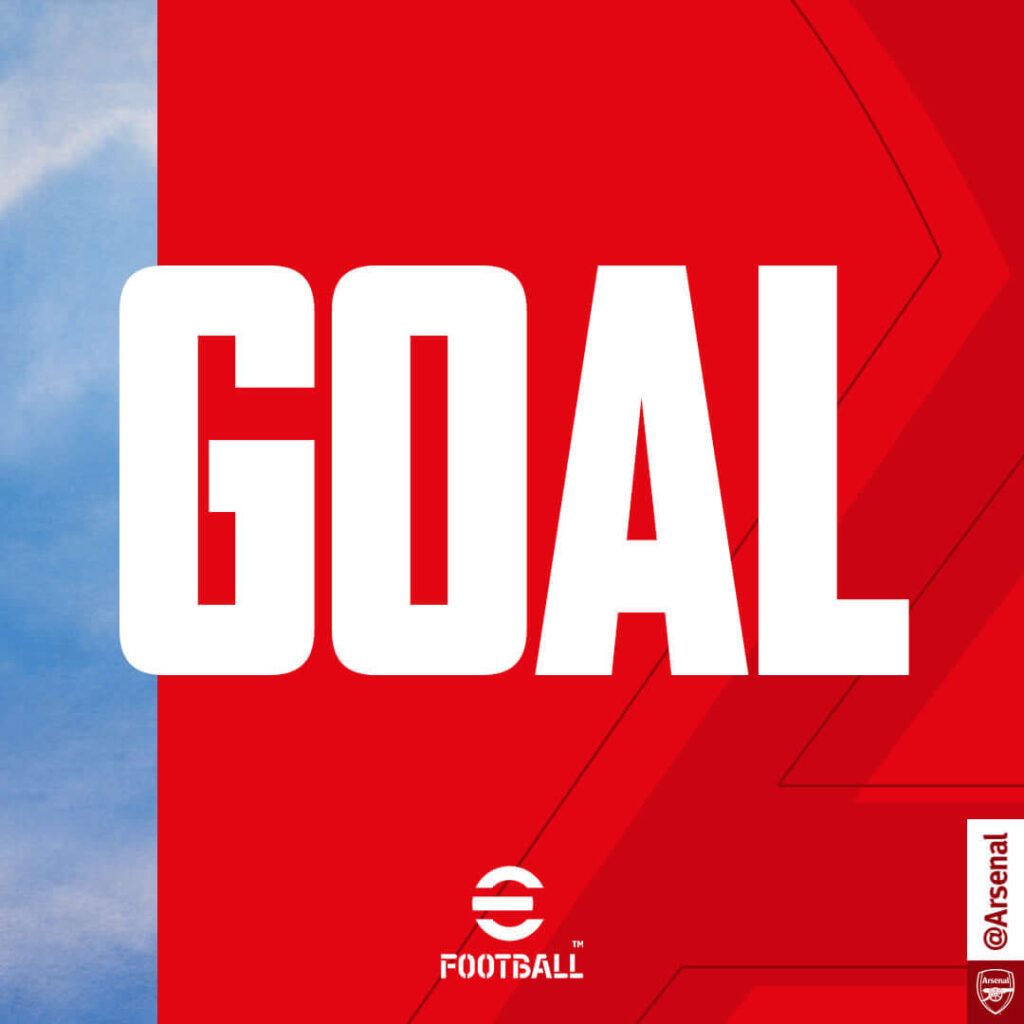
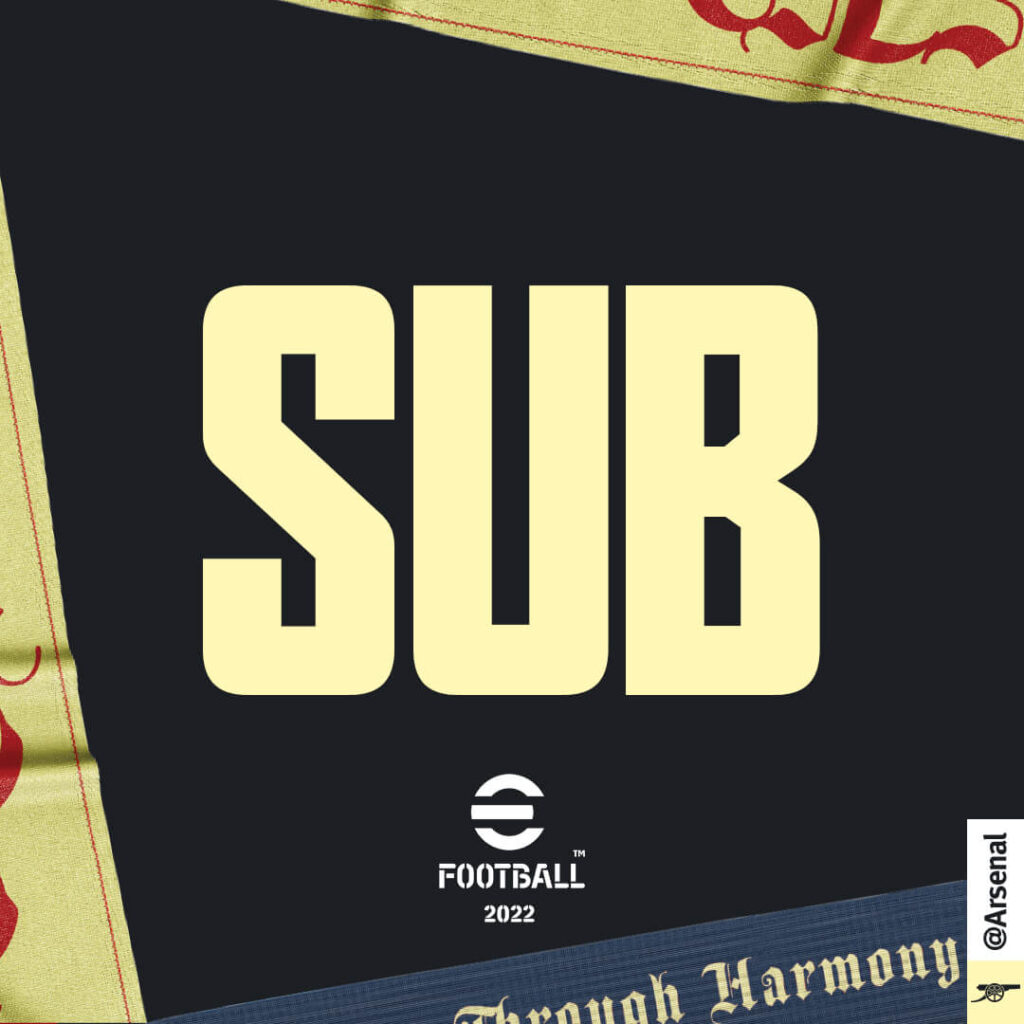
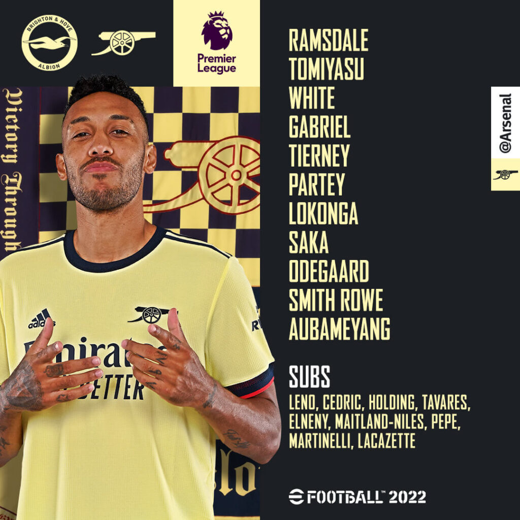
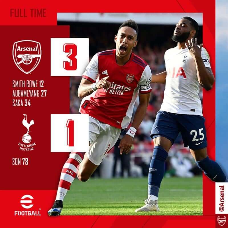
When it comes to Substitutions & Goals, the graphics are left wanting. The images of the players are missing and so are the other details. The MOTM post also fails to mention the name of the player.
Ease of understanding: 4
Brand identity: 4
Creativity: 3
Total: 11/15
Aston Villa – Matchday Graphics
Aston Villa have kept the same visual identity in all of their graphics. Using the kit colors and the design of the kit as inspiration, the visuals on social media have colored backgrounds with elements scattered around the content. Generally, great work all-around, especially with the substitutions which mention the time and the score at which the event took place.
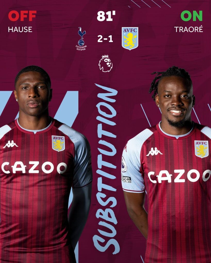
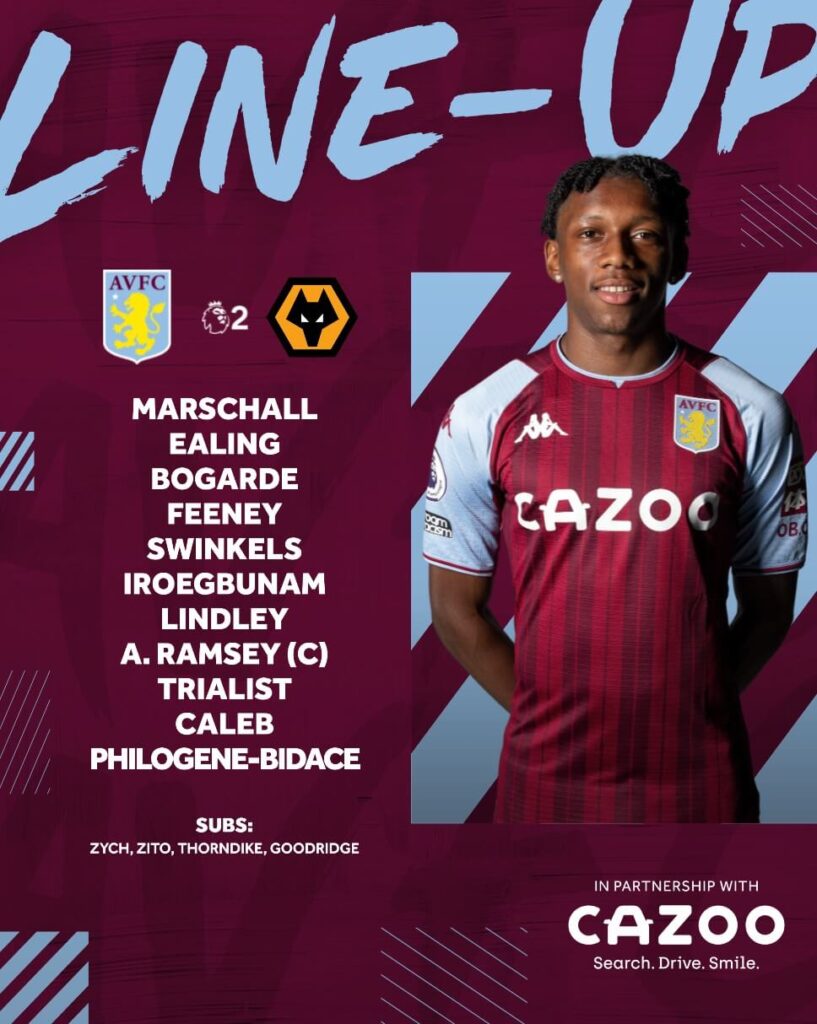
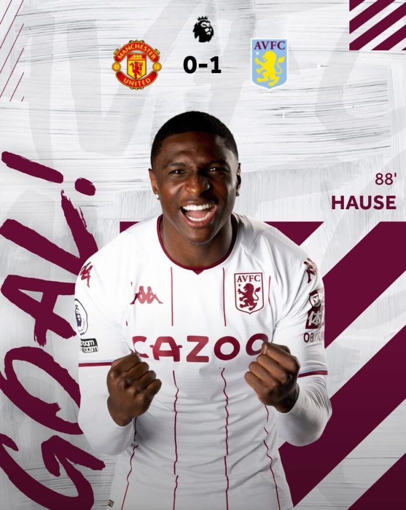
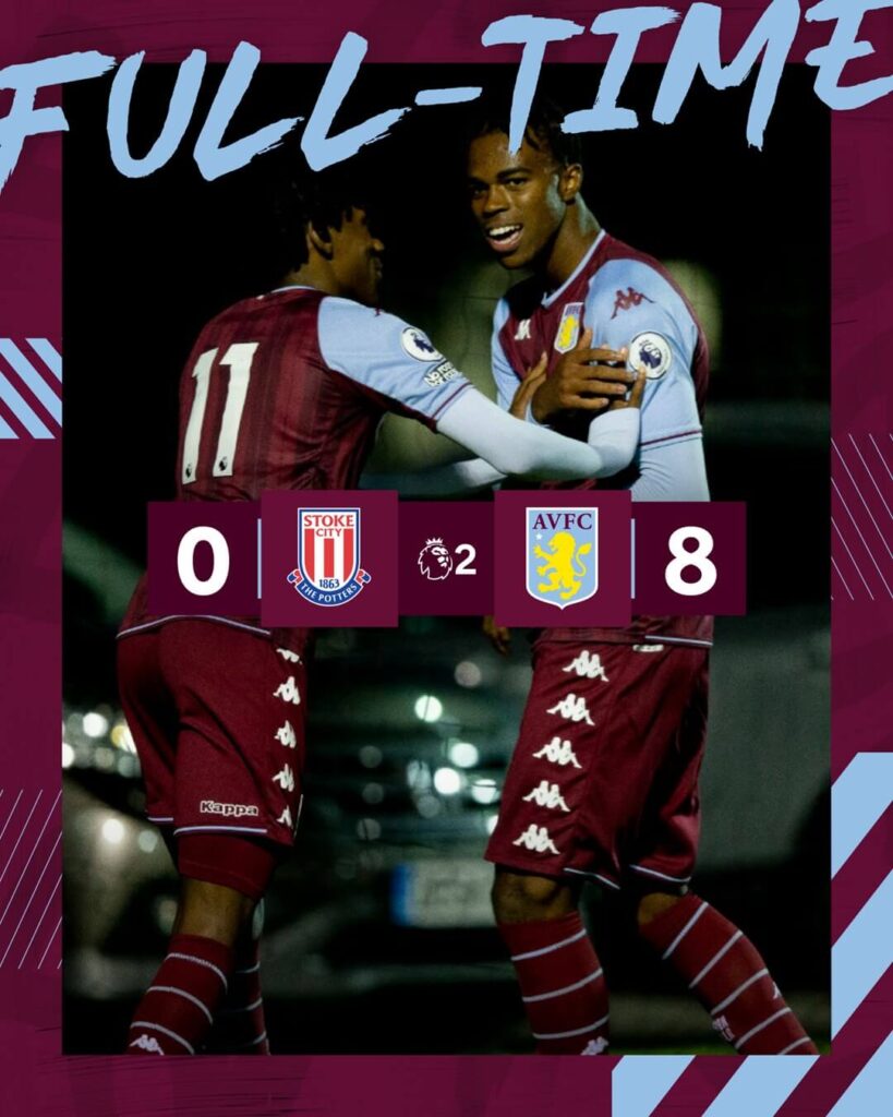
Some of the graphics have the titles which seem to be cut-off as a style. Even one of the players has also not been displayed completely as it seems the graphic did not allow enough space for that. It is definitely a styling or creative thing but some things should just be shown completely.
Ease of understanding: 4
Brand identity: 5
Creativity: 3
Total: 12/15
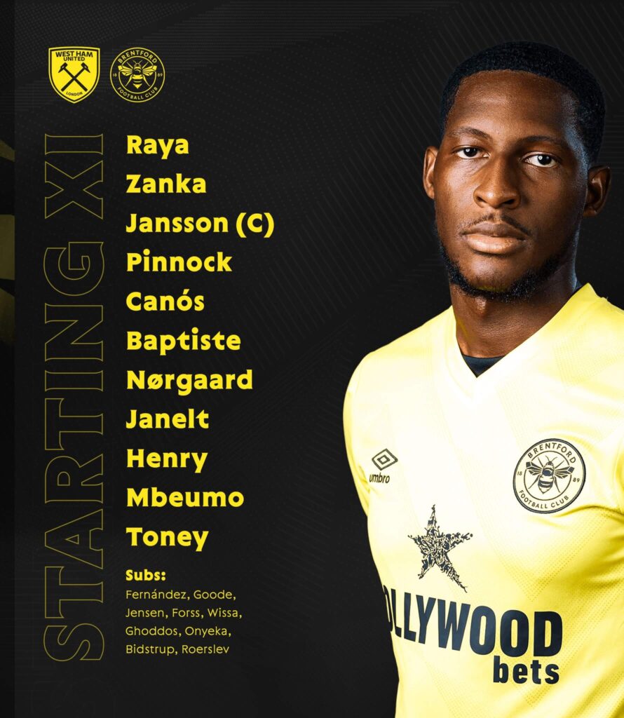
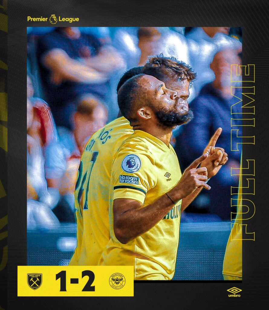
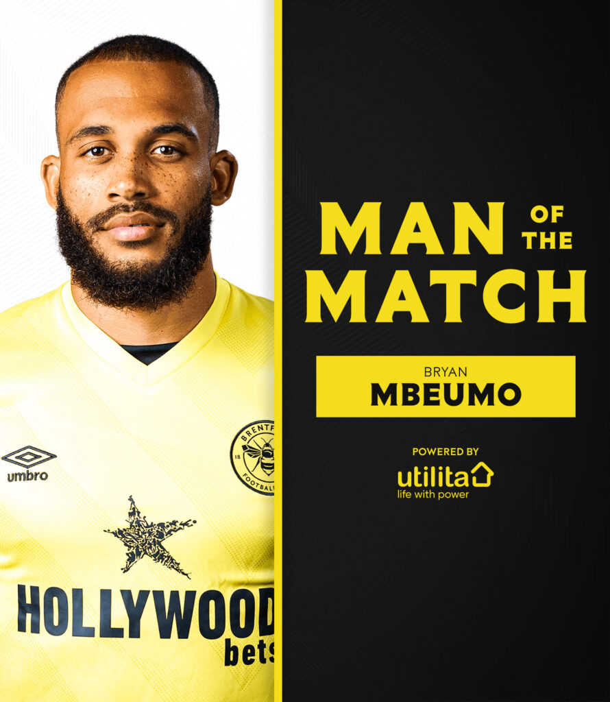
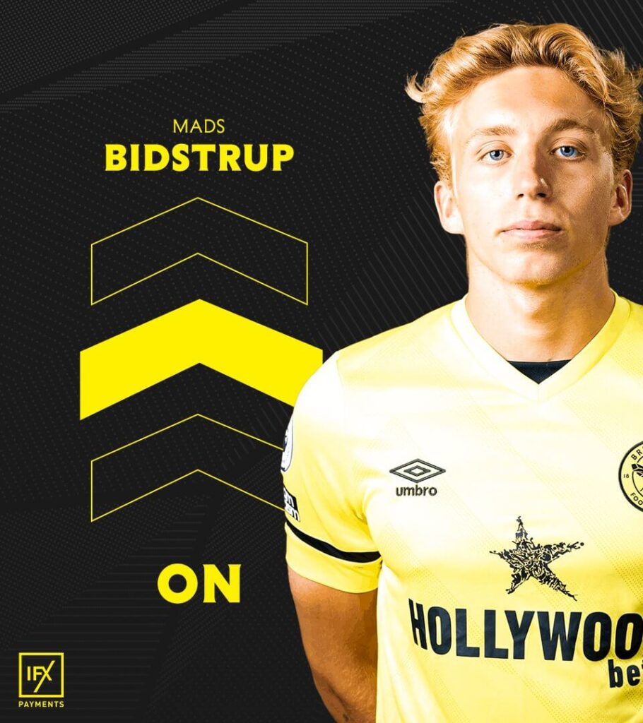
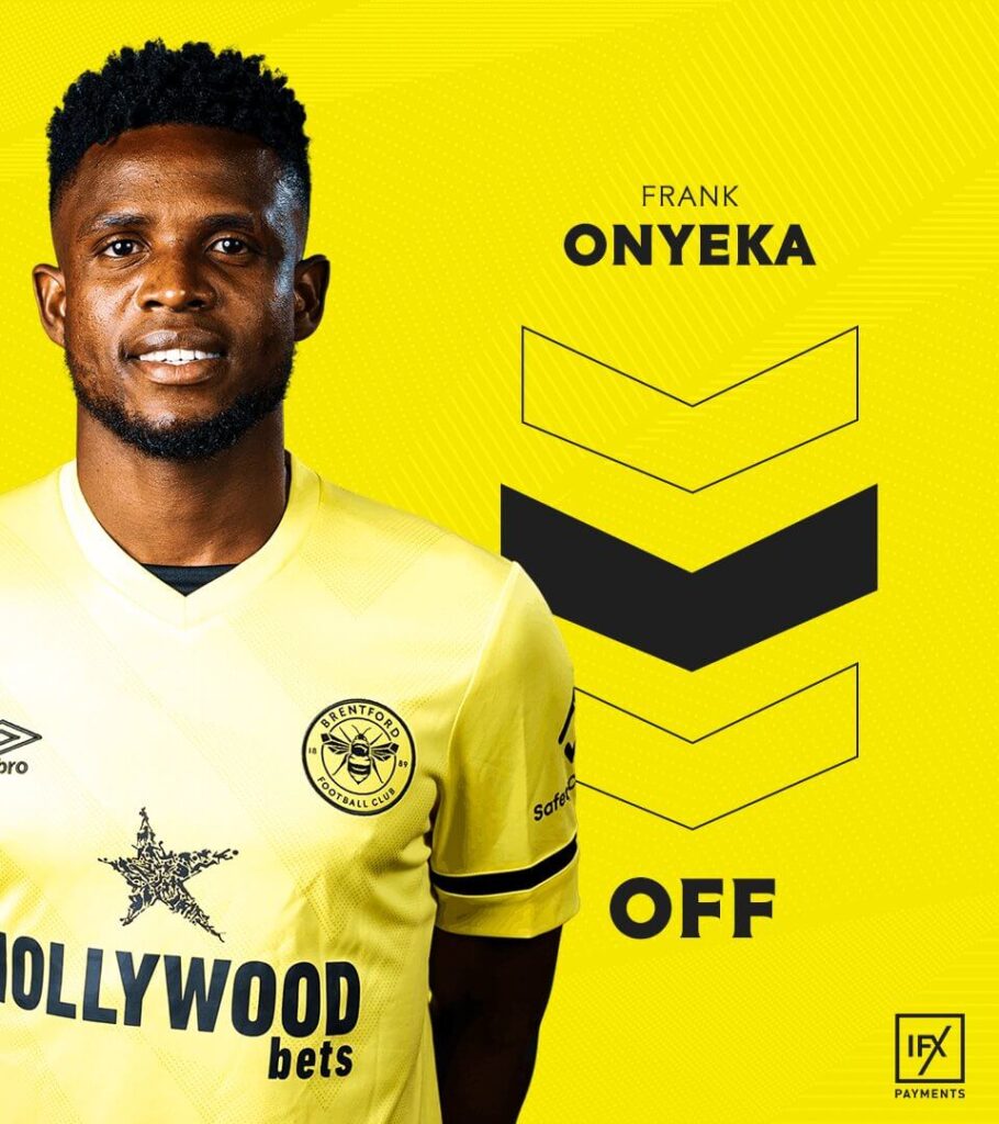
Brentford – Matchday Graphics
Brentford have done well to include their brand colors in the graphics and work with fonts that are big, bold and consistent. The MOTM and Full time graphics for their Premier League campaigns look good however their pictures need to be resized for twitter.
Their substitutions posts are divided into multiple graphics which can be simplified to have all the information at one place for the fans.
WISSAAAAAAAAAAAAAAAAAAAAAAAAAAAAAAAAAAAAAAAAAAAAAAAAAAAAAAAAAAAAAAAAAAAAAAA
— Brentford FC (@BrentfordFC) October 3, 2021
⚒ 1-2 ?#BrentfordFC #WHUBRE pic.twitter.com/h39tryfJsp
Ease of understanding: 5
Brand identity: 4
Creativity: 4
Total: 13/15
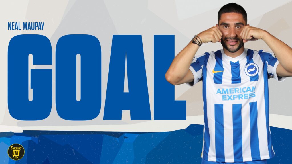
Brighton & Hove Albion – Matchday Graphics
The blue of Brighton & Hove Albion, and shades of it, are the major attention-grabbing aspects of their Premier League graphics in this year’s campaign. Bold and big fonts make it easy for the fans to get the information instantly. The Matchday graphic for the club has to be one of the best of all the teams in the league. The Goal graphic uses a fun picture, and why shouldn’t it. Goals are all about celebration, if you are not too far behind your opposition that is.
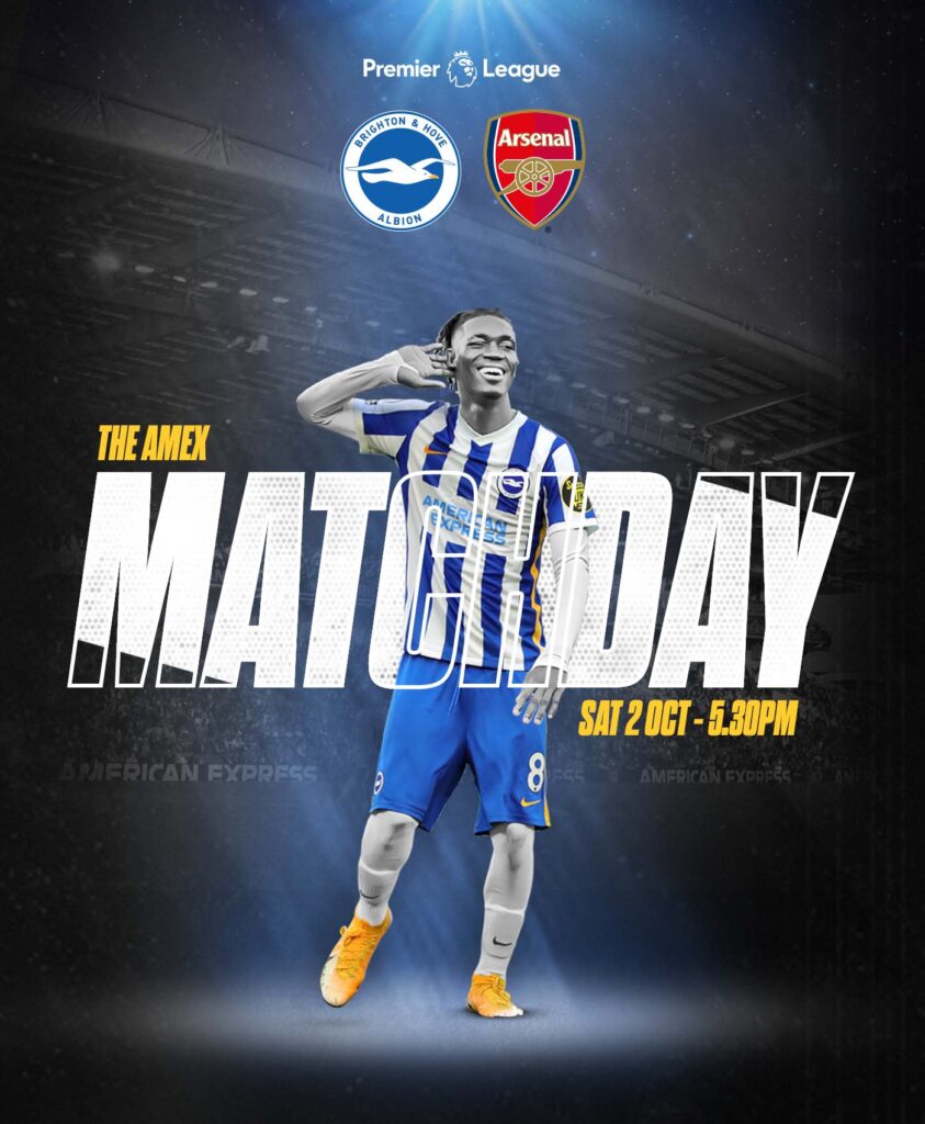
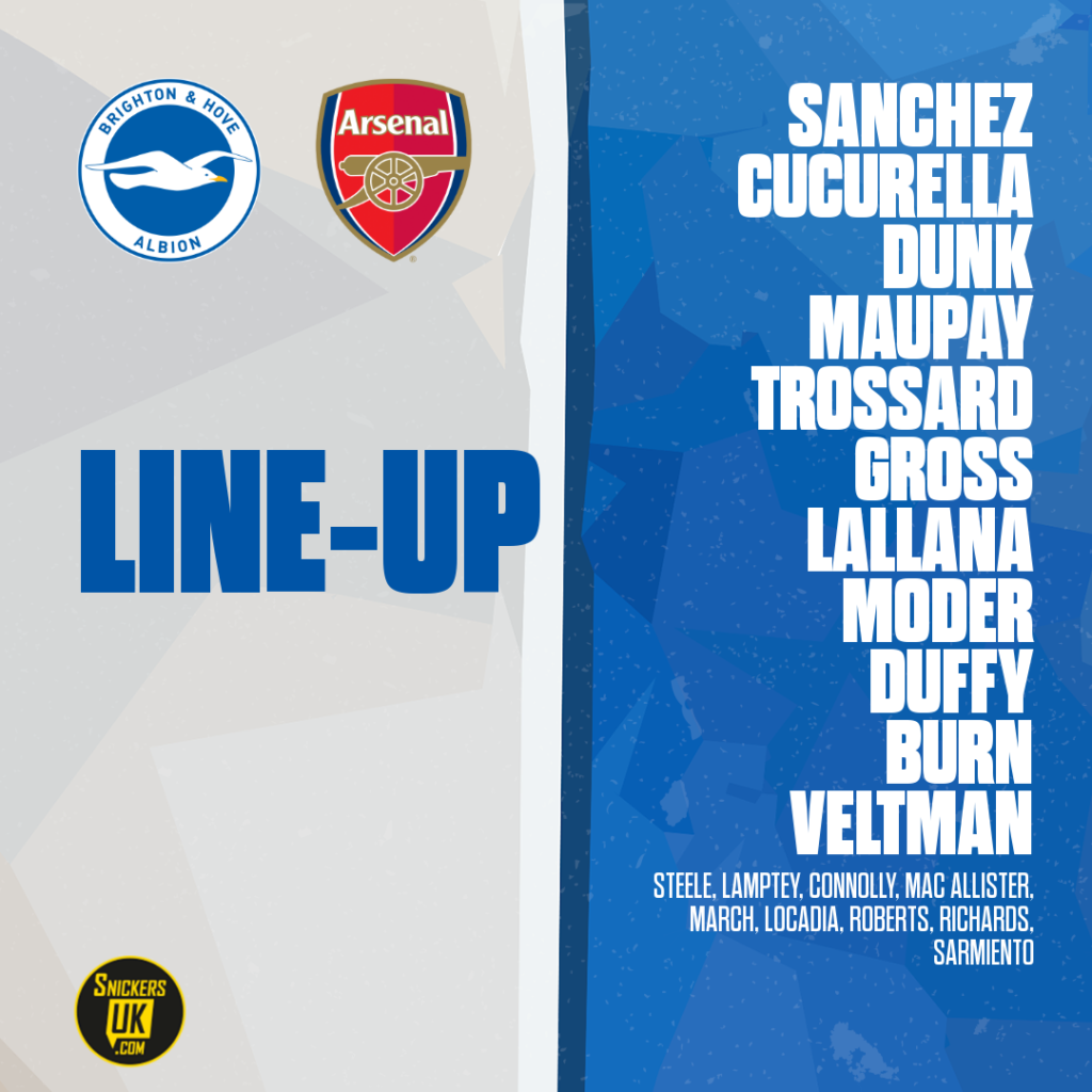
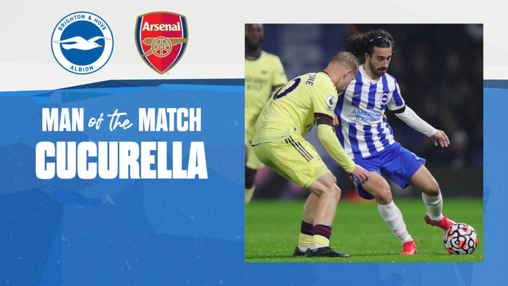
A glaring miss for the Brighton team is that they do not post their substitutions as a graphic. Which is a big miss. Not only does it take away from the whole package, but it also misses out on some major engagement they could be easily getting.
Ease of understanding: 5
Brand identity: 4
Creativity: 3
Total: 12/15
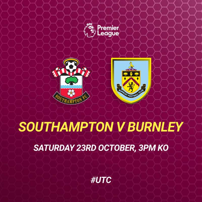
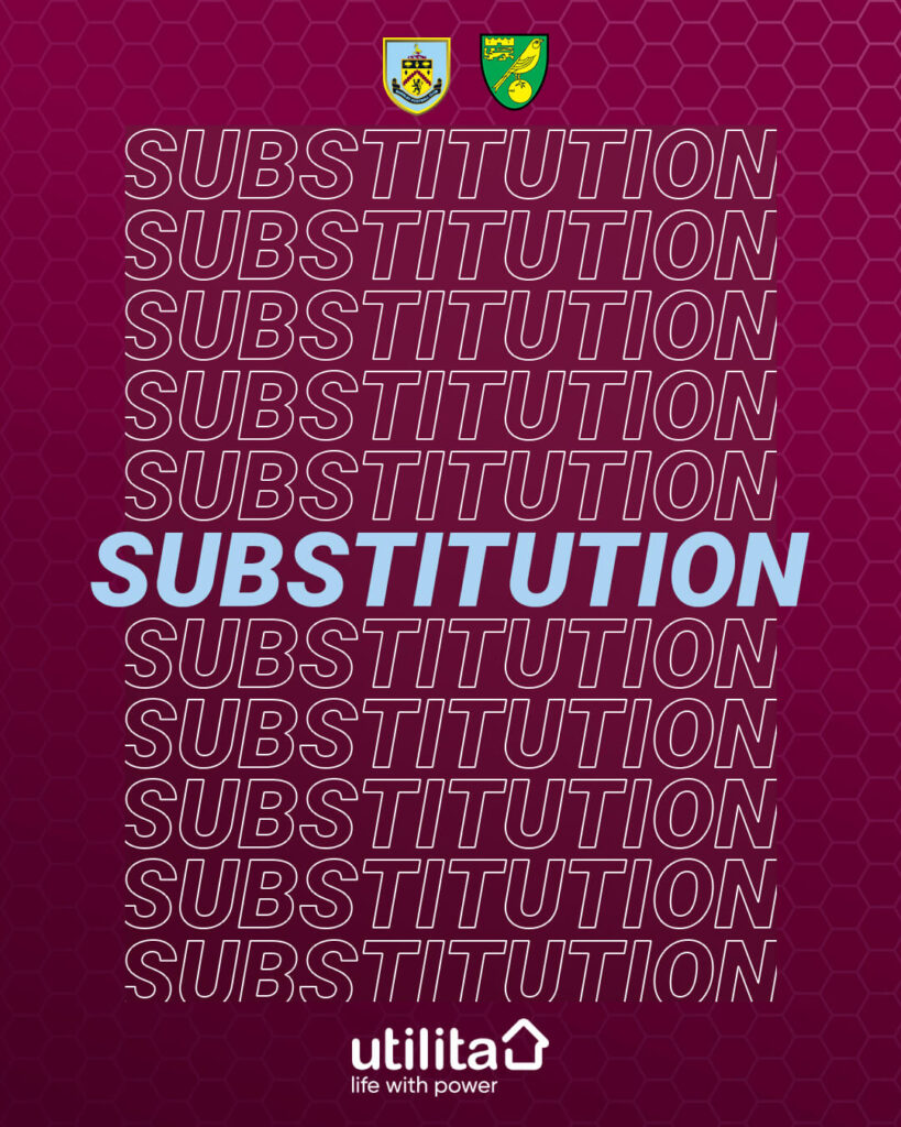
Burnley – Matchday Graphics
Burnley have gone with a more or less uniform background, with solid club colors and a honeycomb pattern, in their Premier League graphics. The Substitutions and the Match Announcement visuals lack the touch of real pictures which to some extent makes the graphics look a little bland.
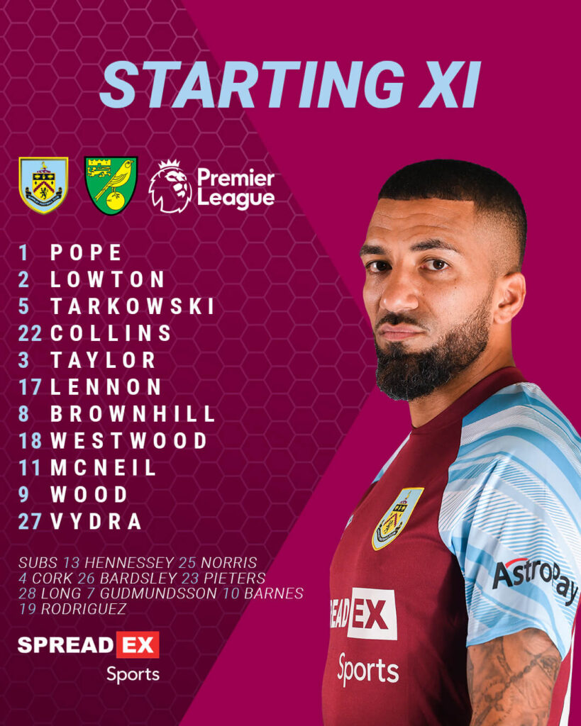
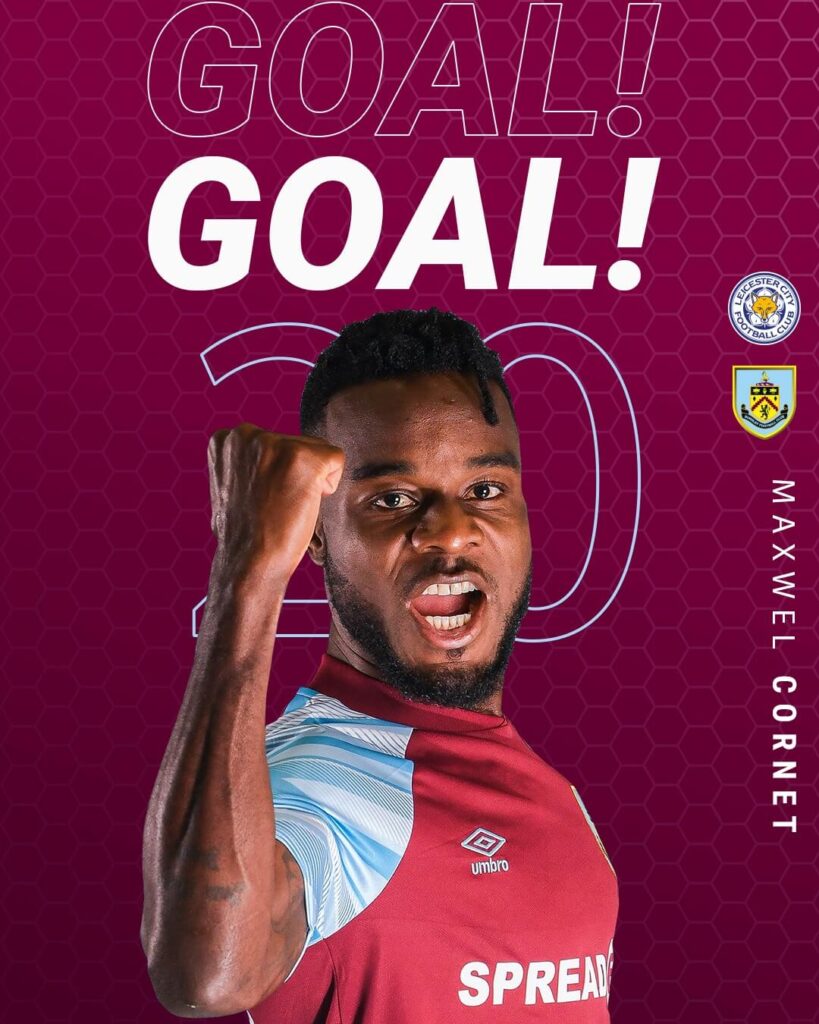
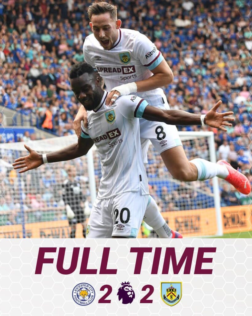
The Full time graphic is the most different out of the visuals in discussion with a picture and the scoreline, serving the purpose, but missing the branding a little and details of the goalscorers.
Ease of understanding: 5
Brand identity: 3
Creativity: 3
Total: 11/15
Chelsea – Matchday Graphics
This season, Chelsea FC developed their graphics in a vintage-like style with the paper-cut effect being dominant. Their content is mostly based on photography, supported by some elements in the background, complementing the designs in their playing kits.
The best thing about Chelsea’s graphics: is the way they have infused their kit colors into their social media branding. It looks effortless and fabulous.
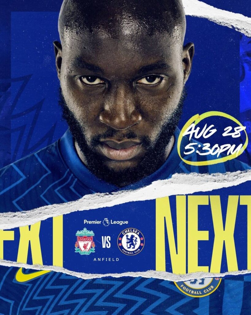
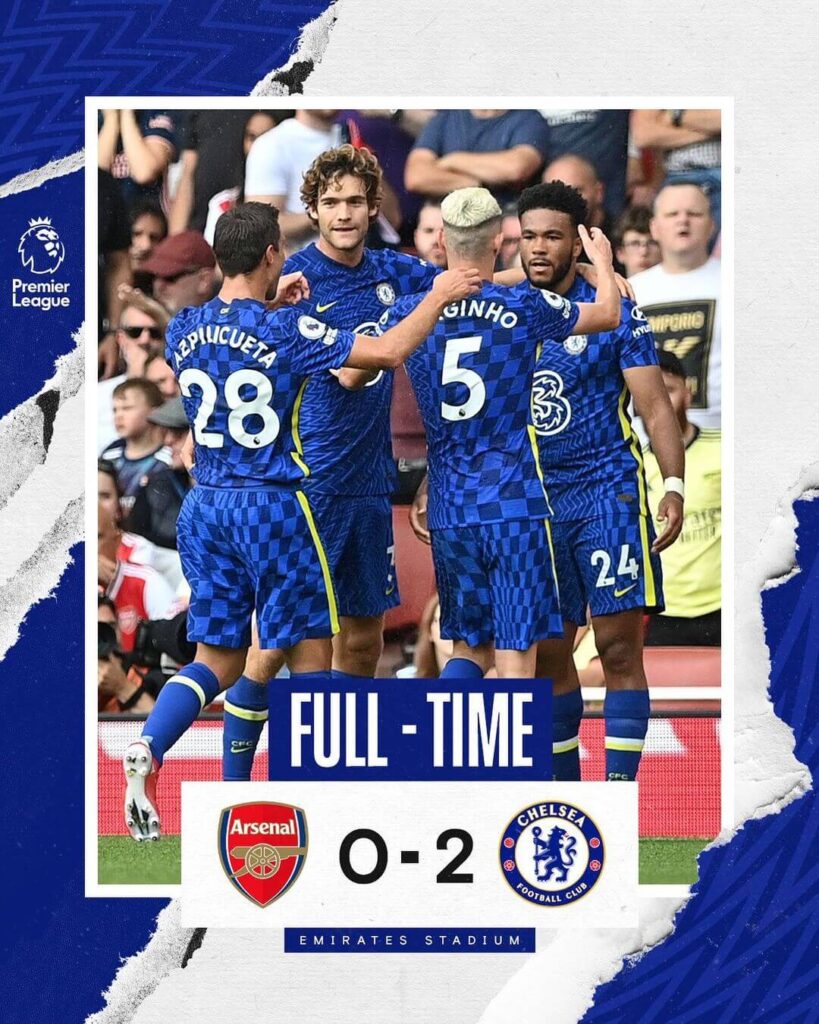
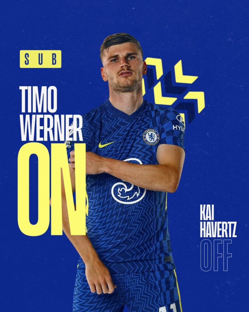
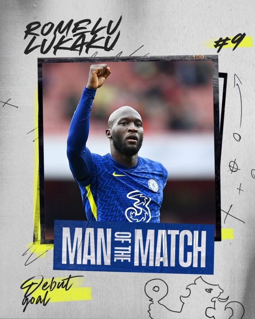
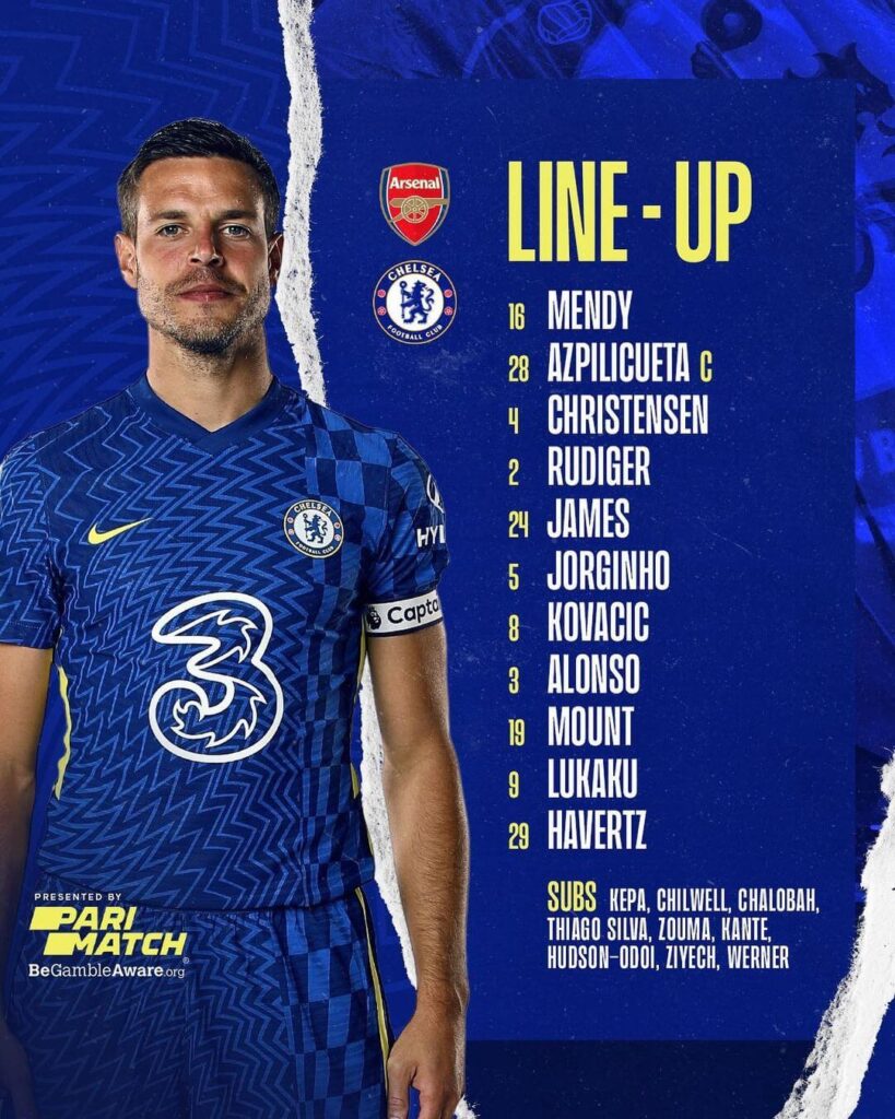
What can Chelsea improve upon: is the announcement of the time at which a particular substitution took place on their graphics.
Ease of understanding: 4
Brand identity: 5
Creativity: 5
Total: 14/15
Crystal Palace – Matchday Graphics
Crystal Palace has a very colorful outlook to their graphics. Using the multiple colors used in their kits, they use diagonal lines in the backgrounds and the players and pictures in the foreground. The fonts and the information are easy to grasp but lack some information on a few of the places.
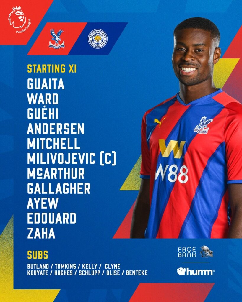
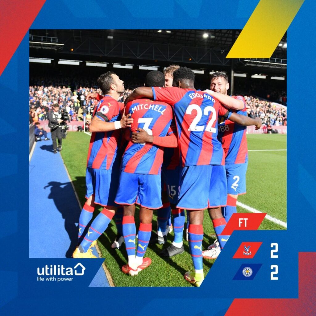
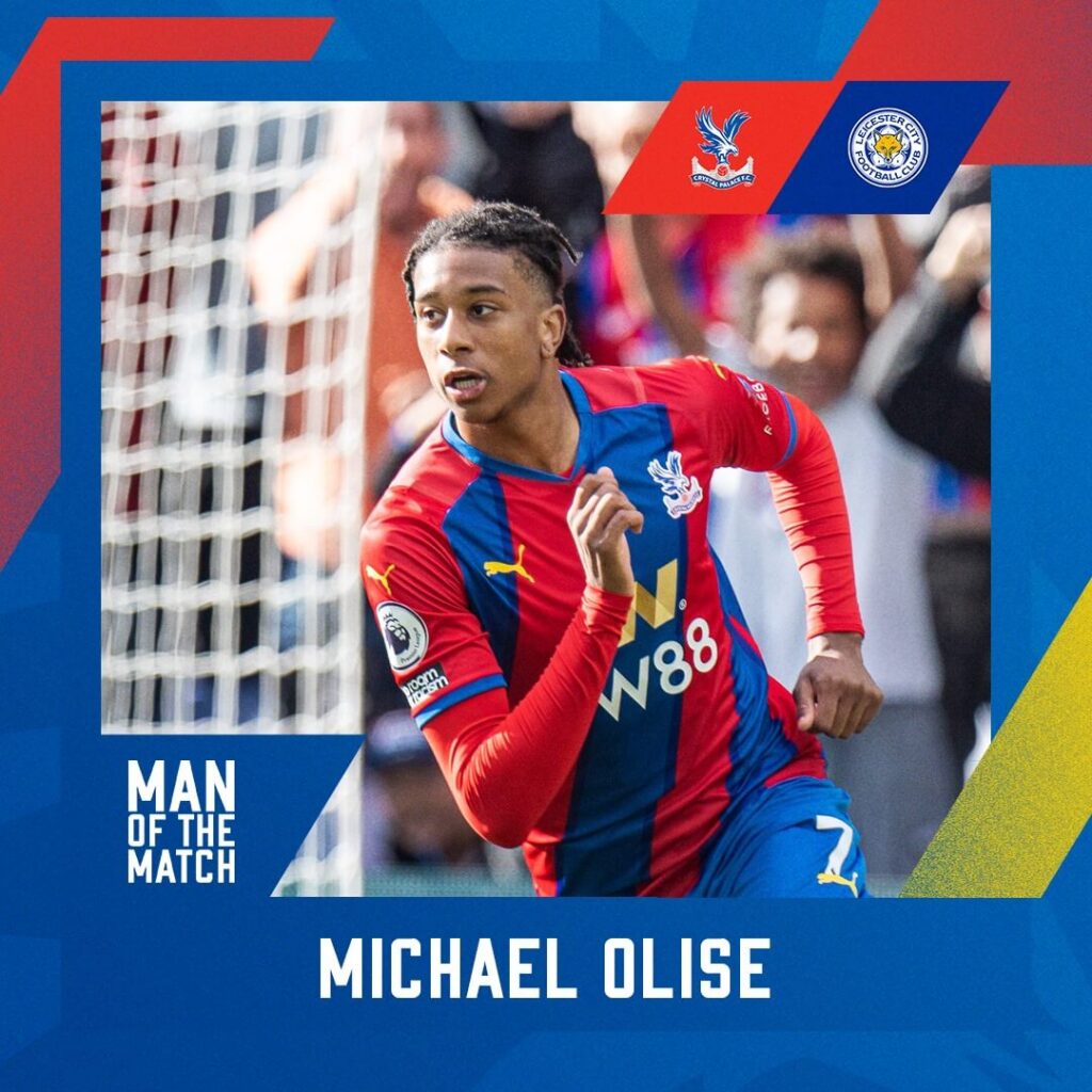
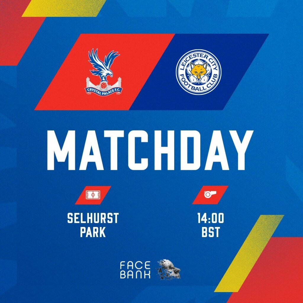
The Substitution graphic is missing altogether, and the Goal visual is a generic one without the time or the name of the goalscorer.
AN EVEN QUICKER IMPACT pic.twitter.com/6SISxep6bp
— Crystal Palace F.C. (@CPFC) October 3, 2021
Ease of understanding: 5
Brand identity: 3
Creativity: 5
Total: 13/15
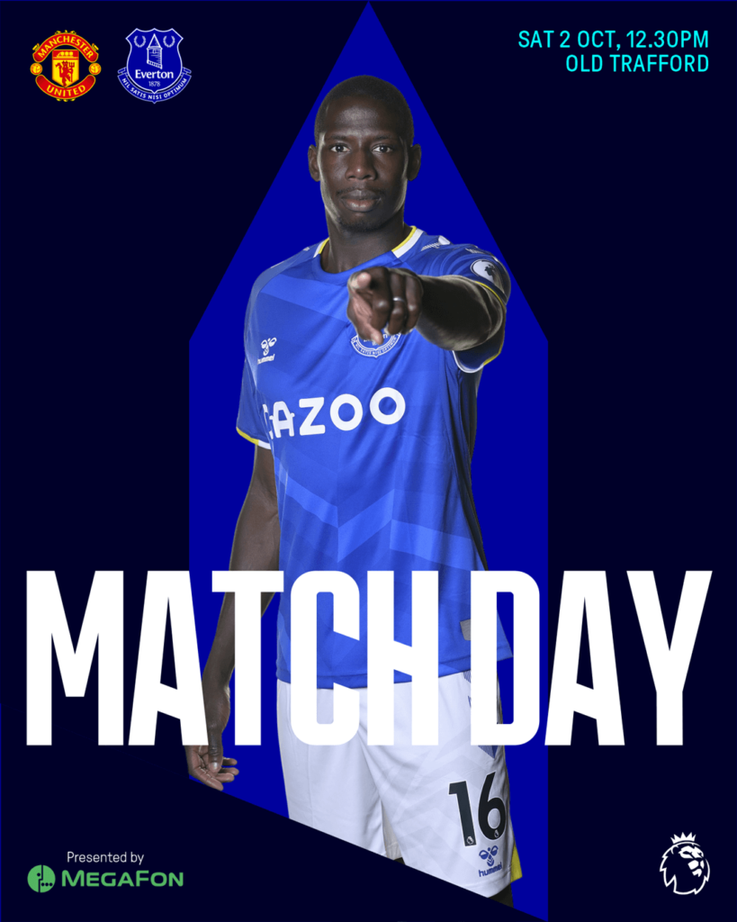
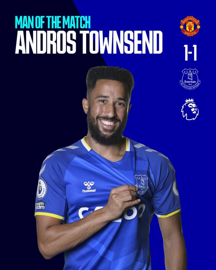
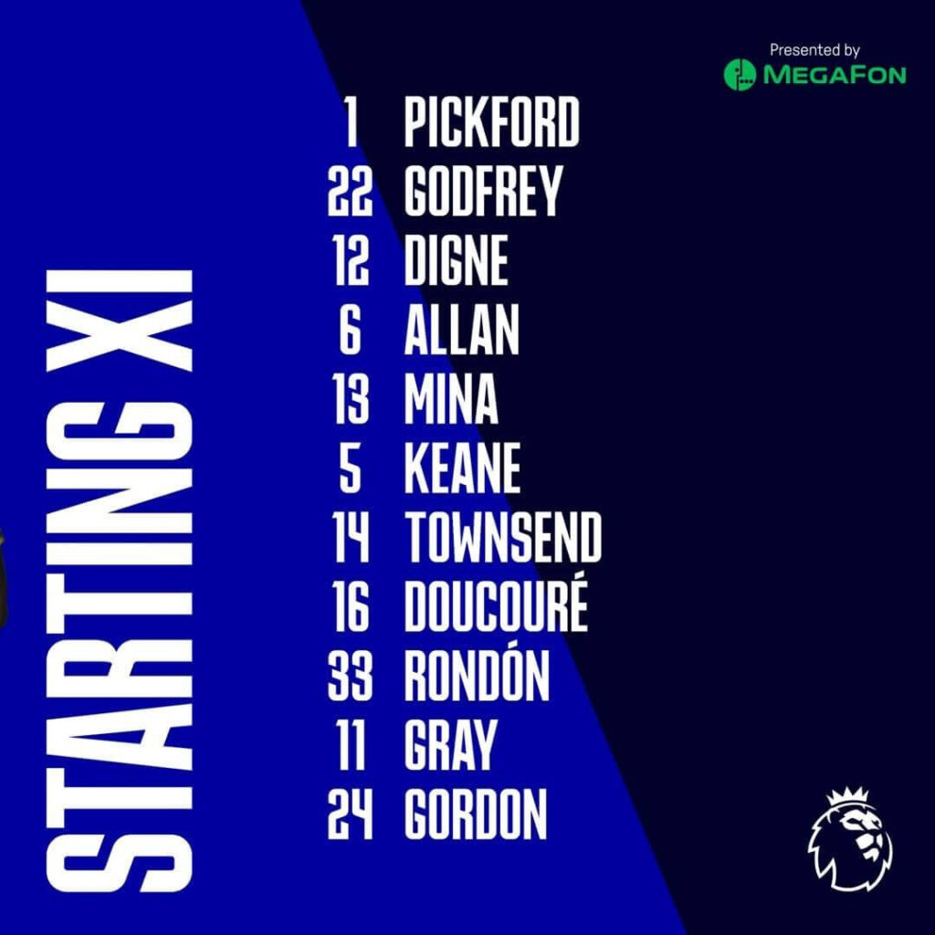
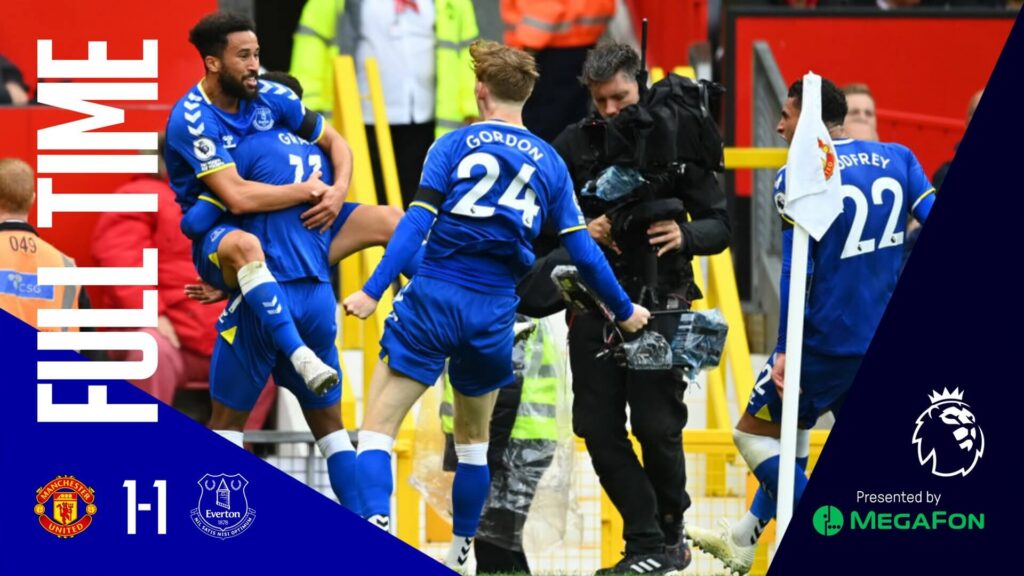
Everton – Matchday Graphics
Solid colored backgrounds in darker and lighter shade of blue, big fonts to announce the posts, and clean and crisp graphics is what Everton Football club has gone for in the latest season of the Premier League. Their MOTM graphic stands out with the result of the match announced alongside the player.
OH YESSSSSS!! ?
— Everton (@Everton) October 2, 2021
? 1-1 ? #MUNEVE pic.twitter.com/dEd9L0gY7l
The substitutions visual could definitely be improved by mentioning the times of the substitutions and the line up post can be a single graphic rather than 3 different pictures which the fans have to scroll through. Single images seem to be the norm in the Premier League clubs when it comes to showing the lineups.
Ease of understanding: 3
Brand identity: 3
Creativity: 3
Total: 9/15
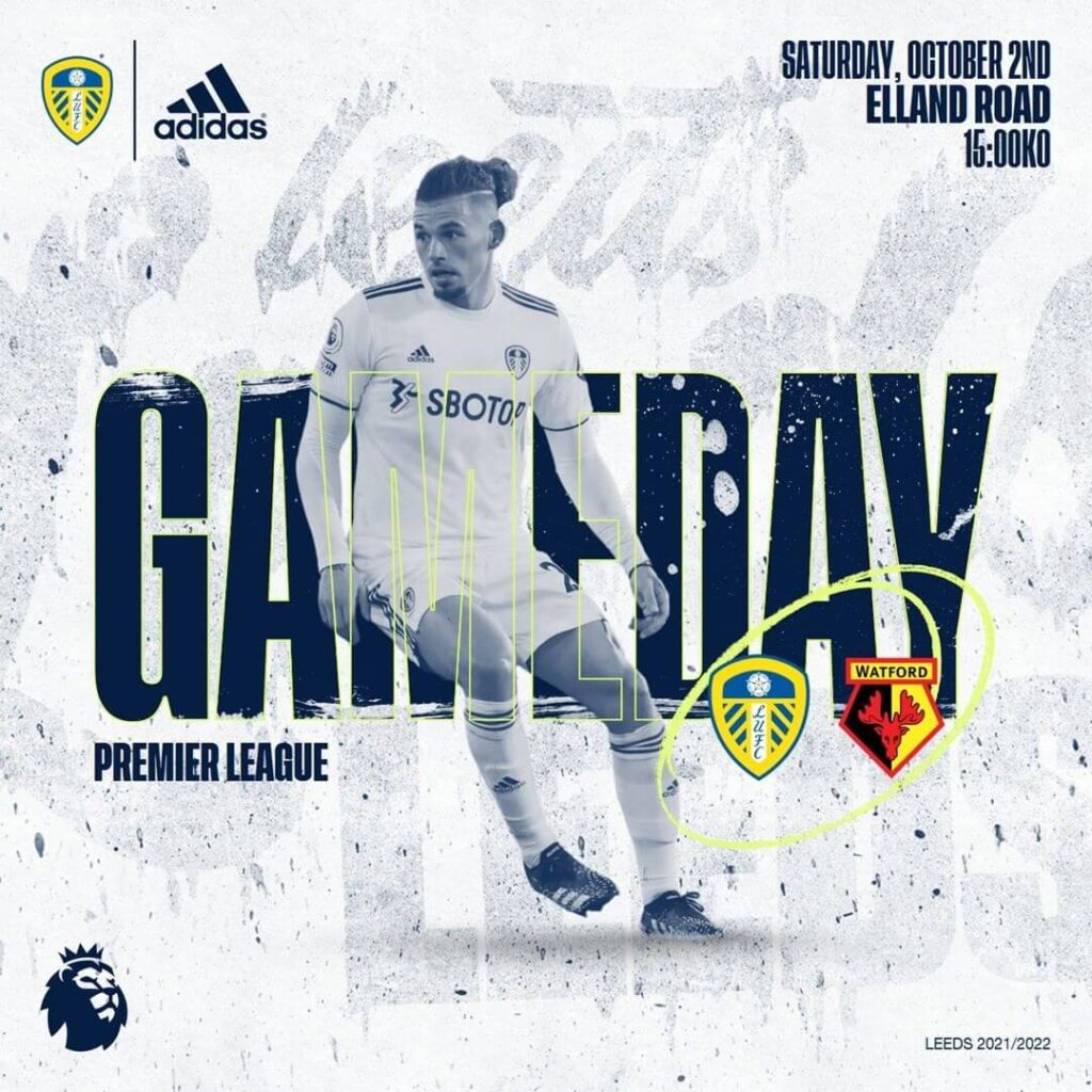
Leeds United – Matchday Graphics
The Leeds United graphics uses the light yellow color which seems a little off from their kit colors. The spray paint effect with a grungy white background can be seen in most of their artwork. Brownie points to them for their Goal visuals; showing the respective match score, the goal scorer and the time of the goal.
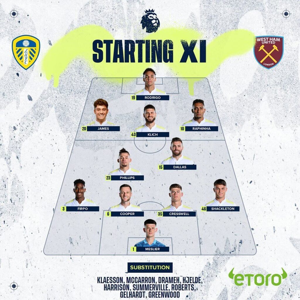
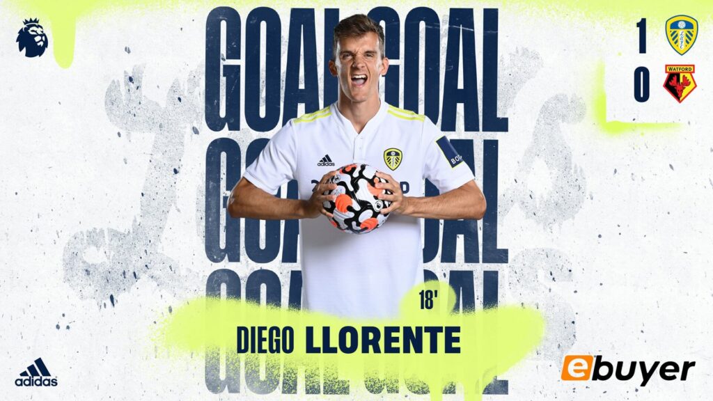
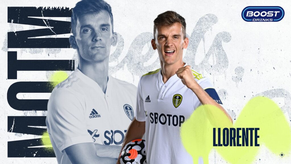
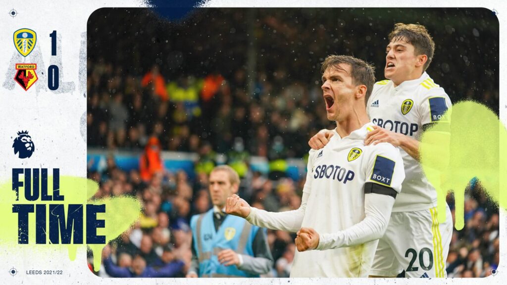
The colors of the club could be better integrated into the design to make it more appealing.
Ease of understanding: 5
Brand identity: 4
Creativity: 5
Total: 14/15
Leicester City – Matchday Graphics
The blue color used in Leicester’s image doesn’t look familiar to fans, it’s not the same blue. It’s a little darker and is presented in different shades on the graphics. The fonts are clear but they overlap the player’s picture in the team lineup.
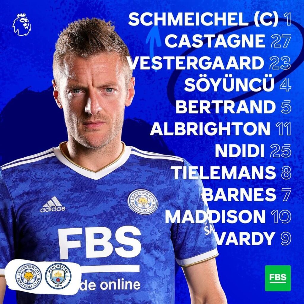
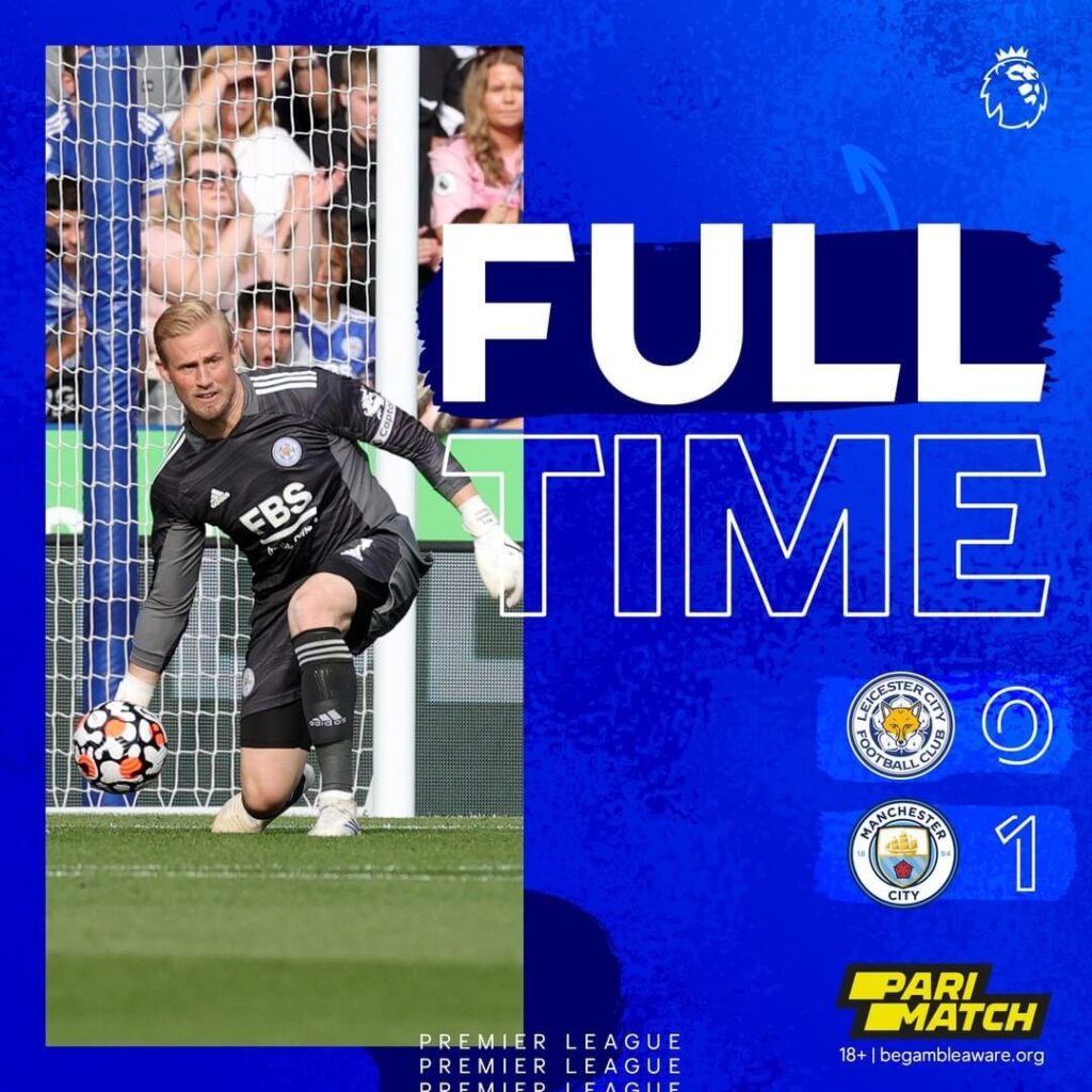
The team lineup this season is showing the numbers of the players but misses out on the list of substitutes on the bench for the club. Similarly, the substitution graphics fail to mention the player coming off and the player coming on.
Ease of understanding: 4
Brand identity: 4
Creativity: 3
Total: 11/15
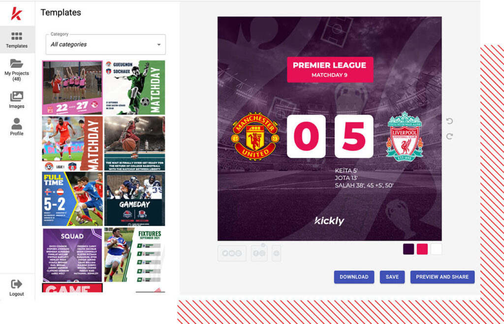
Liverpool – Matchday Graphics
Liverpool have upped their game on the Premier League graphics table as well. Using the different segments of the stadium in the background, the papercut effect in the foreground with clear fonts and branding makes it a set of very appealing visuals. They clearly announce the fixtures as Home or Away to gear up their supporters.
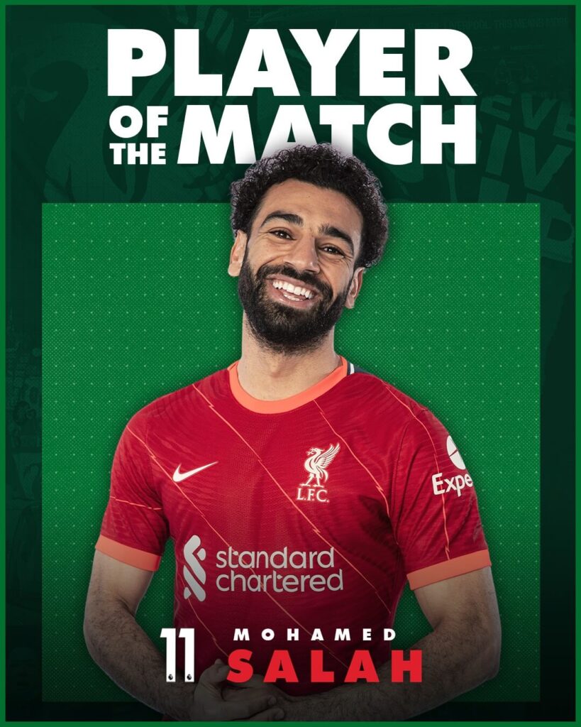
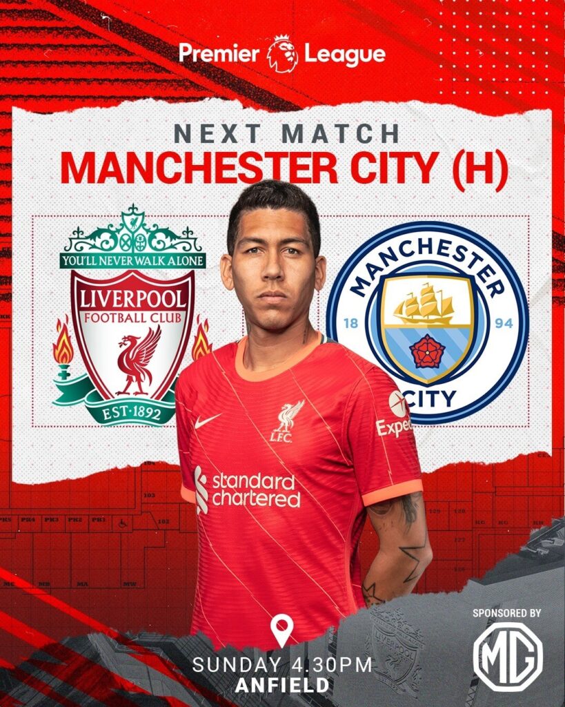
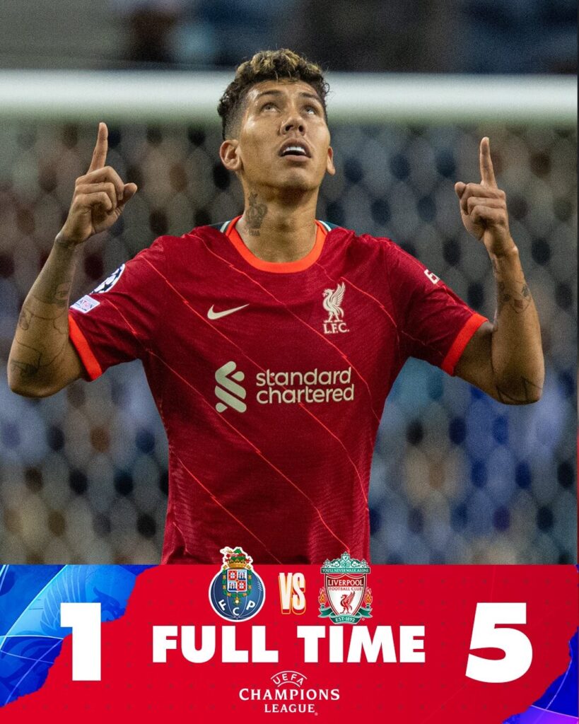
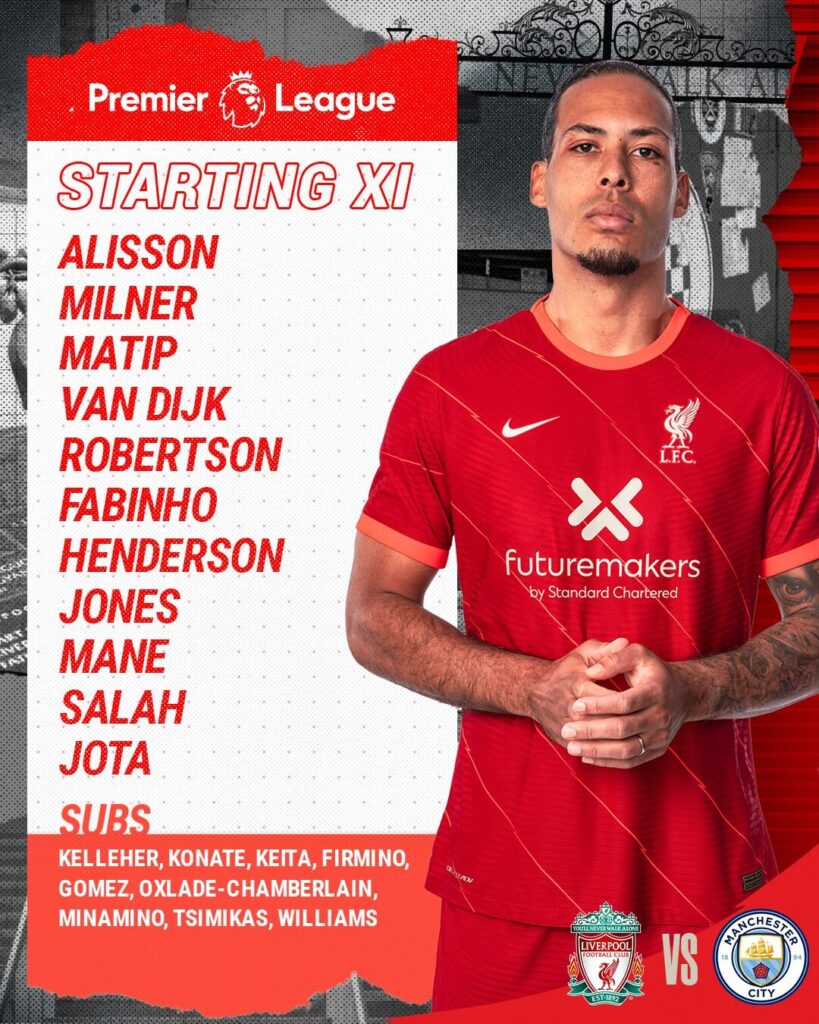
The Goal graphic is one of the best in the league in the form of a short video.
OH MY WORD!!!!!!!!!!! IT’S SALAH AND IT IS SIMPLY STUNNING!!!!!!!! ? pic.twitter.com/82ub2xoHHC
— Liverpool FC (@LFC) October 3, 2021
The Final Score is using a match picture and announcing the score with any details of who scored when. The substitutions are completely missing an artwork.
Ease of understanding: 5
Brand identity: 4
Creativity: 4
Total: 13/15
Manchester City – Matchday Graphics
This season, we can spot a lifestyle vibe in Man City’s social media design in the Premier League. Shades of the team colors are used in the background with straight lines in a minimal yet vibrant style. The pictures of the players are dominant in the graphics.
The best thing about the Manchester City matchday coverage is the MOTM graphic which is clear and easy to understand. The score in the minute scores is usually mentioned in the caption, which is a little strange at first but it makes the image more clear.
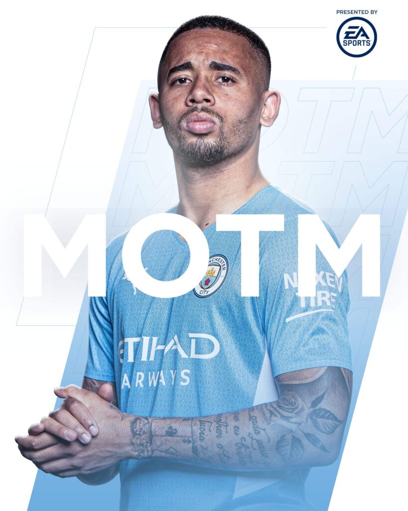
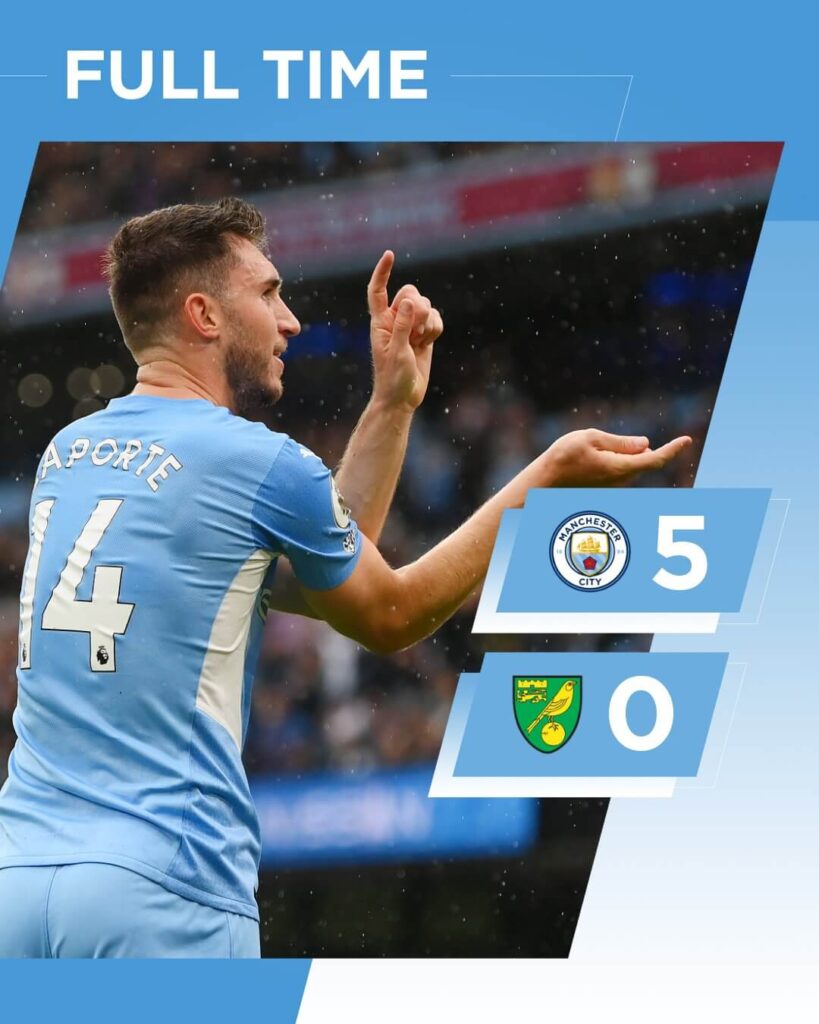
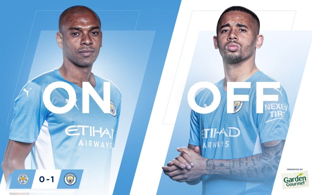
The full time score mentions the result but falls short of mentioning the goal-scorers and their respective timings.
Ease of understanding: 5
Brand identity: 5
Creativity: 5
Total: 15/15
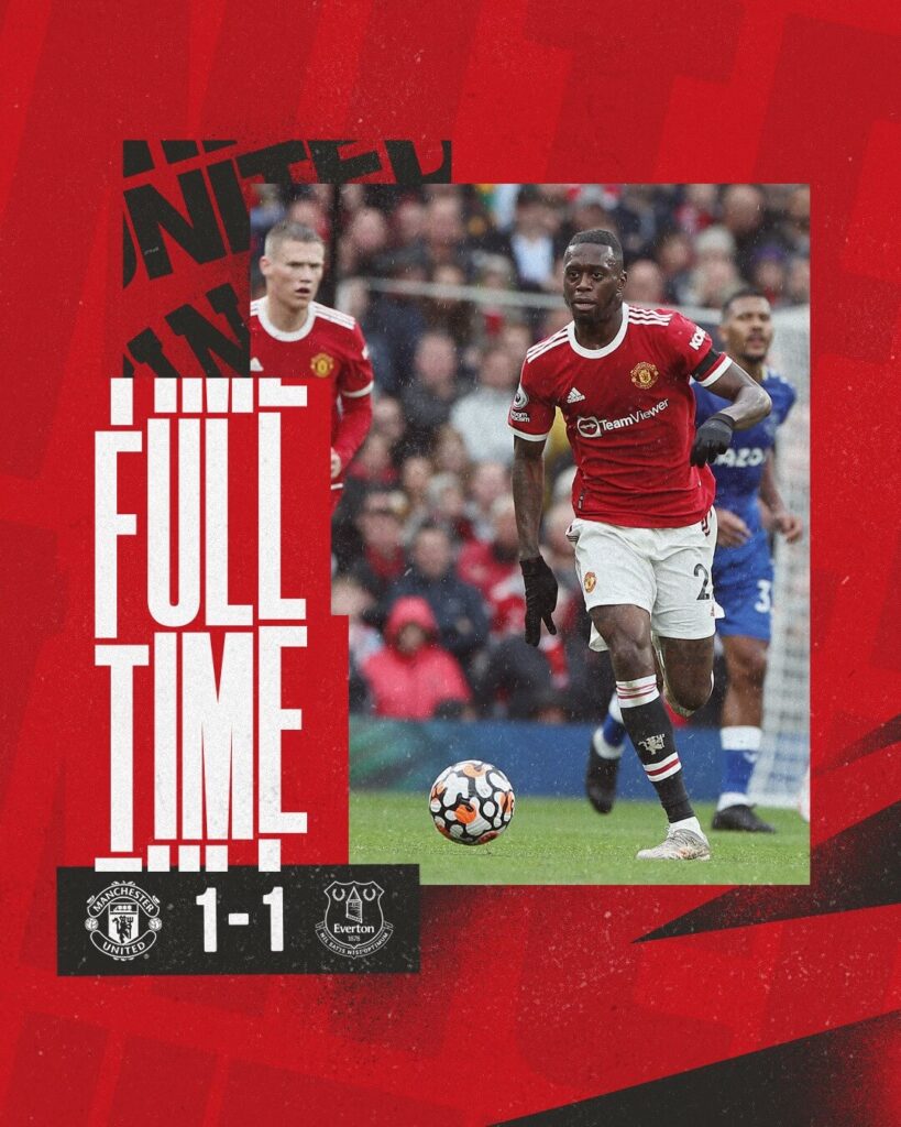
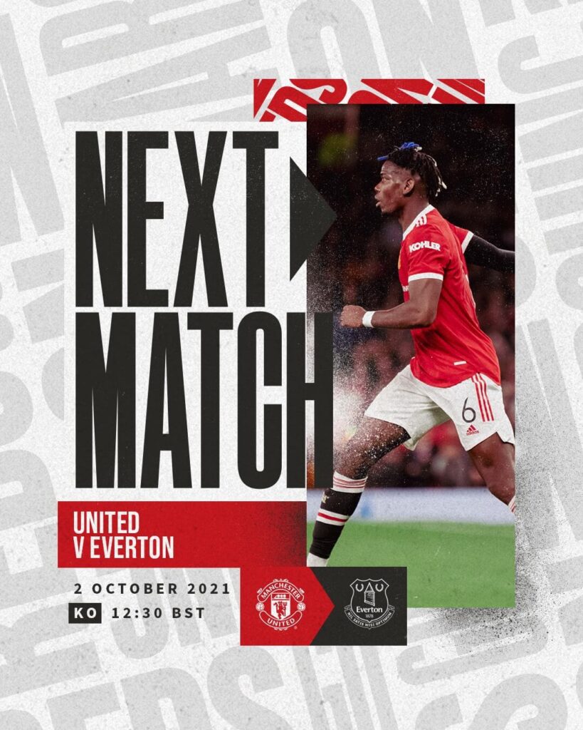
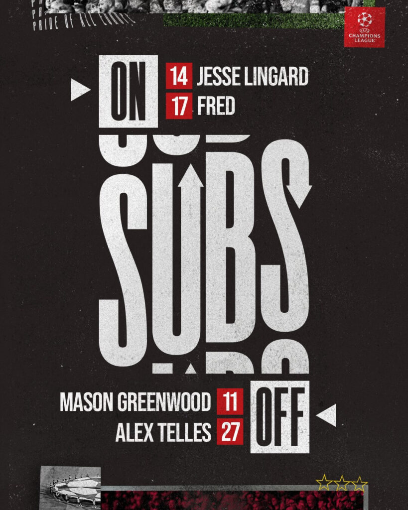
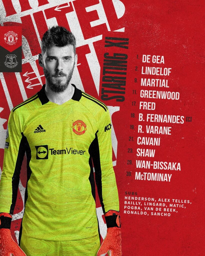
Manchester United – Mathday Graphics
The famous red of Manchester United is once again a dominant part of their graphics template. The background used is a grunge theme with subtle text used brilliantly for branding purposes which is a plus. The foreground has the players and the information and with a hint of a black and white touch to them. The goal graphic is beautifully animated but fails to showcase the picture of the player.
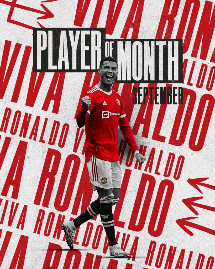
— Manchester United (@ManUtd) October 2, 2021
In terms of the Substitutions graphics, it fails to mention the time of the match in which the substitutions take place. A small point, but some necessary information to keep the fans informed.
Ease of understanding: 5
Brand identity: 5
Creativity: 5
Total: 15/15
Newcastle United – Matchday Graphics
Newcastle have one of the best Match Announcement graphics with a busy background and players in the foreground with a three dimensional style. Generally, they have opted for busy backgrounds, a dark colored theme, with elements scattered all across the visuals. The Goal graphic and the Full time scores also have pivotal details – the time and the name of the goalscorer – on it.
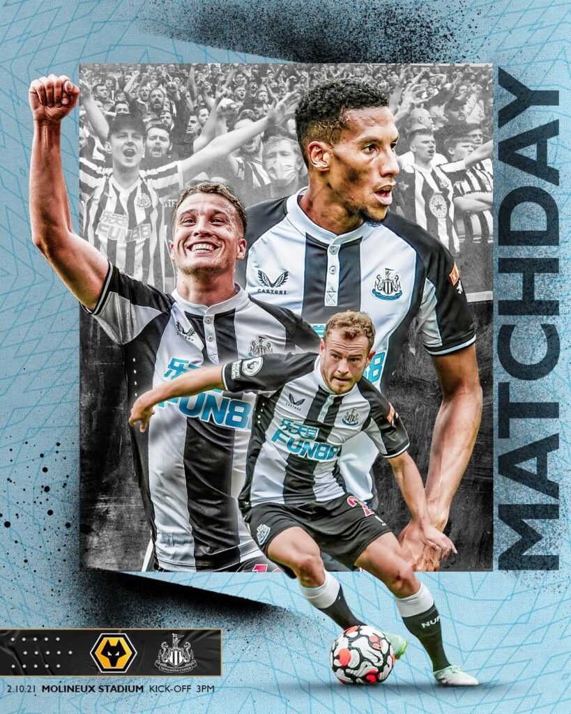
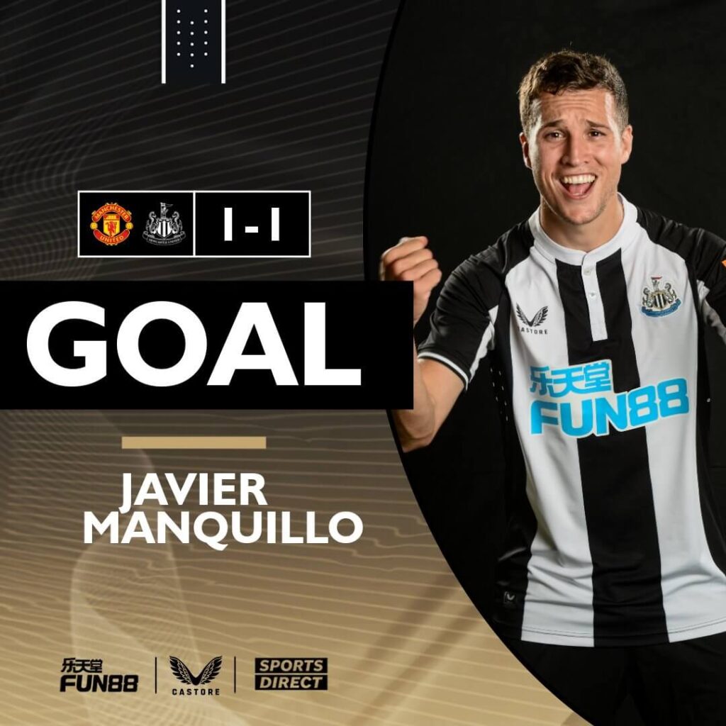
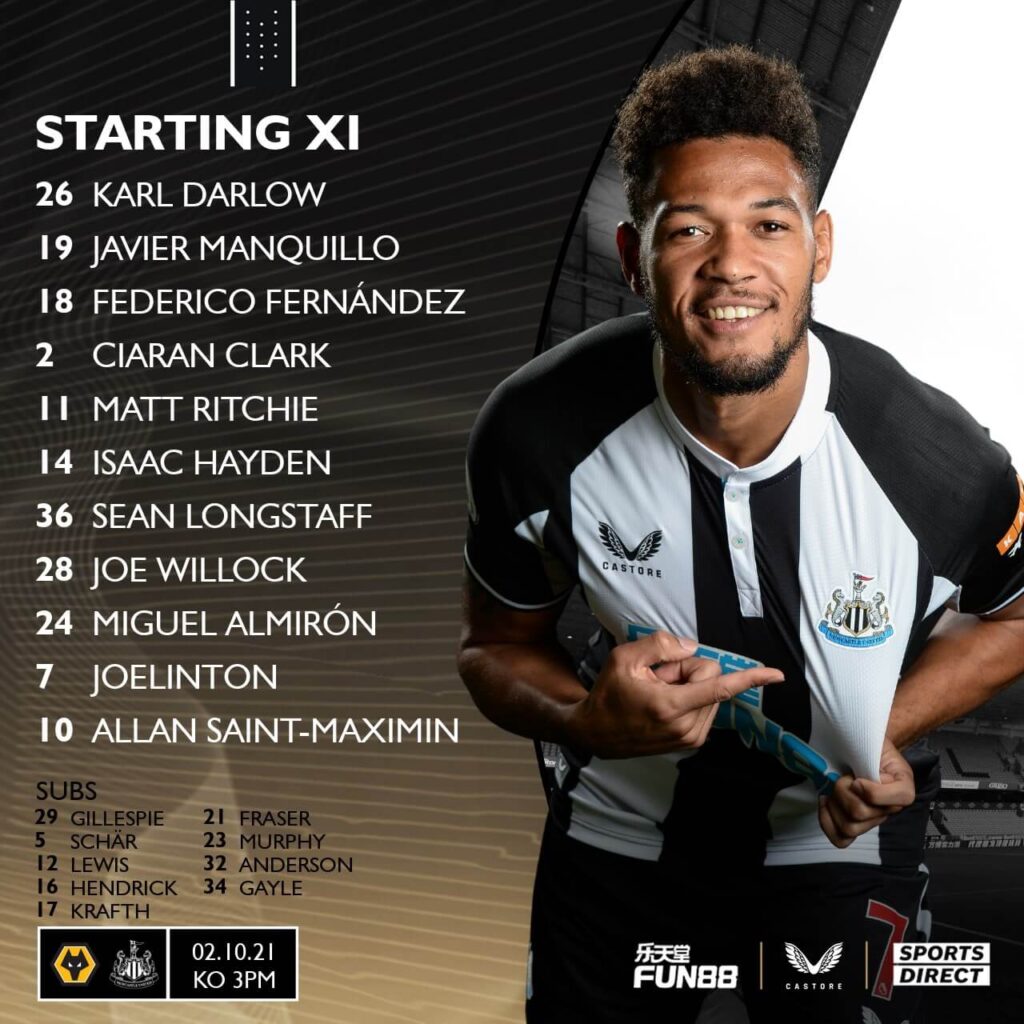
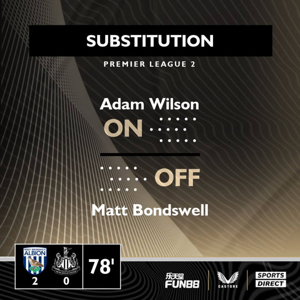
The Substitutions, even though mentioning the name and the number, miss out on the pictures of the players but overall, great work from them.
Ease of understanding: 4
Brand identity: 4
Creativity: 3
Total: 11/15
Norwich City – Matchday Graphics
Norwich’s branding is bang on target in their Premier League graphics. Using the yellow as the base color of their designs alongside the green for the titles and the curvy lines in the background, makes for a great presentation of their work. The MatchDay graphic also gives space for the color integration of the opposition.
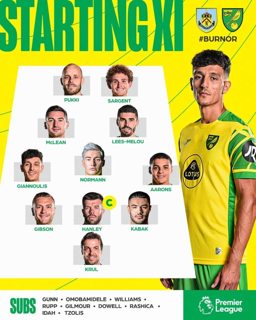
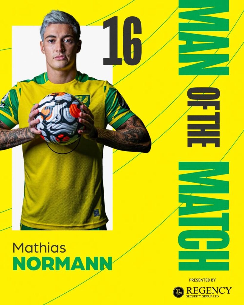
The starting XI might have the numbers missing but it goes beyond just announcing the starting XI, it goes on to show the formation of the side on the field as well which we hardly get to see by the clubs.
Ease of understanding: 5
Brand identity: 5
Creativity: 5
Total: 15
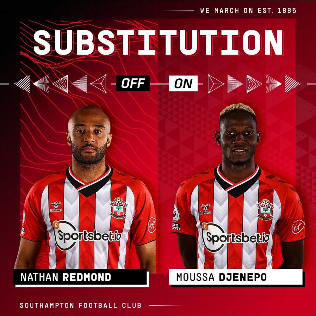
Southampton – Matchday Graphics
Southampton have used small triangular elements throughout their Premier League graphics this season. The inspiration seems to be taken from the design of the kit so there is uniformity in the branding on ground and on their social platforms. Using gradients and busy backgrounds, the fonts usage is good and clear.
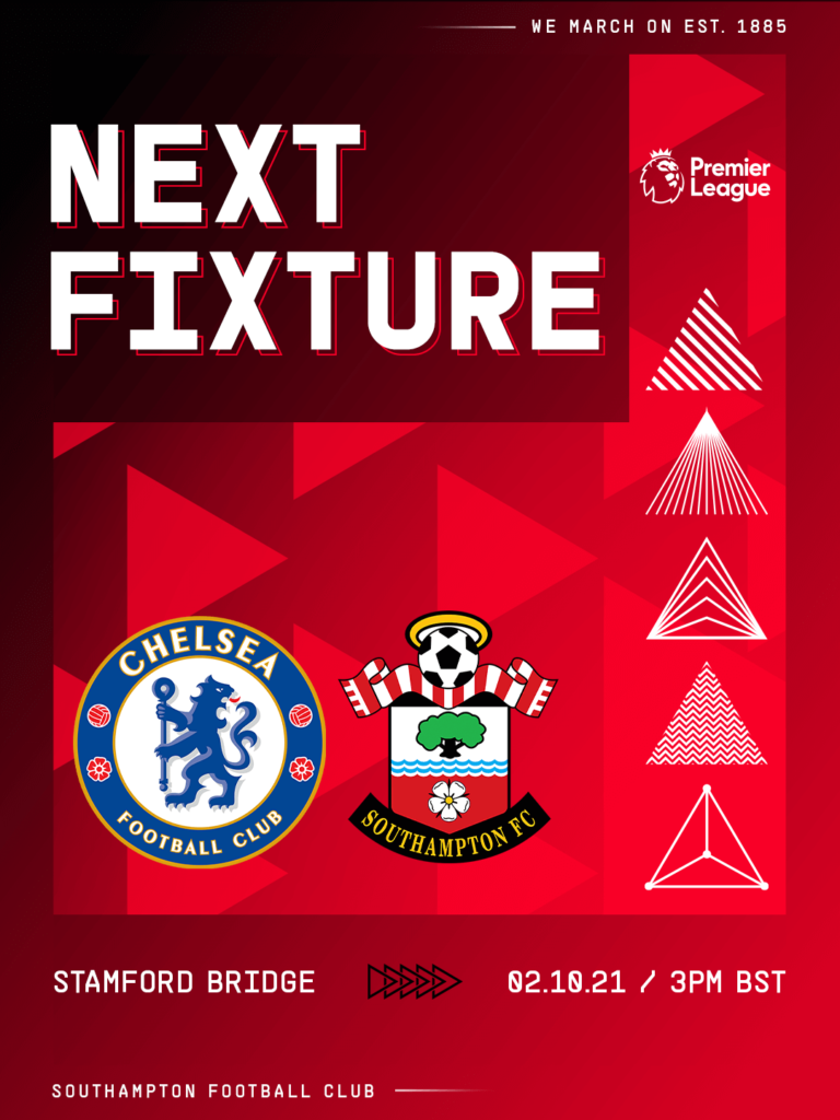
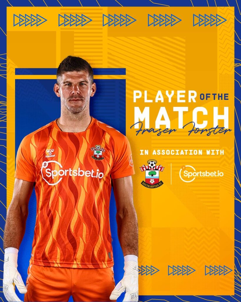
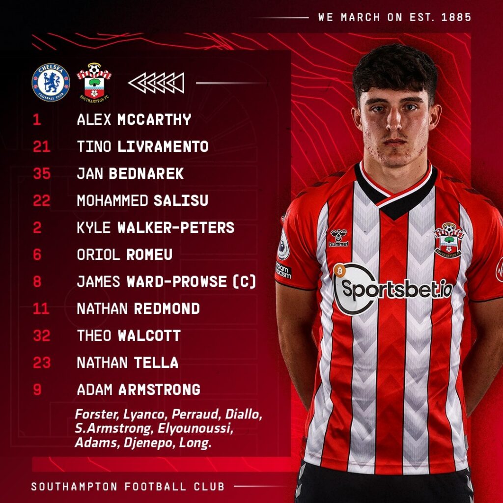
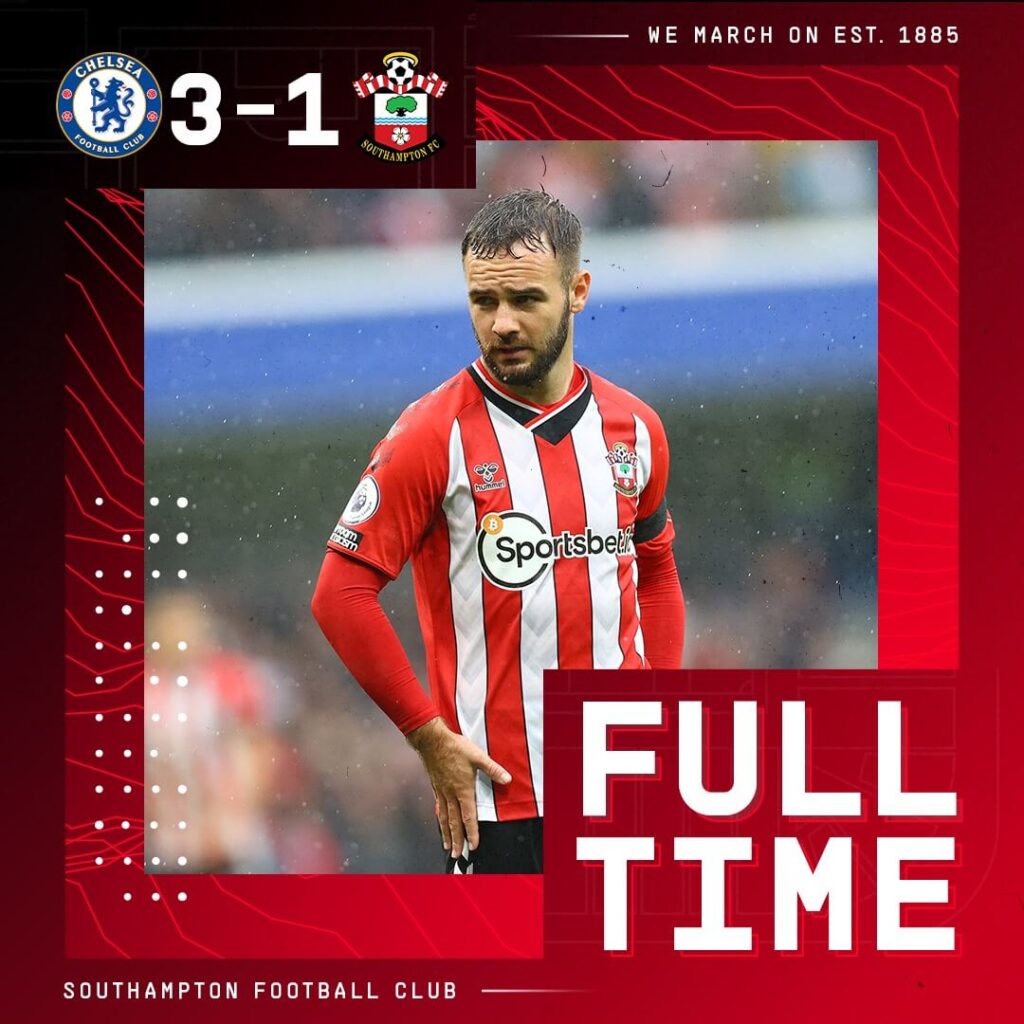
The Man Of the Match graphic looks a little too busy with a lot going in the background. The Goal visual fails to mention the goalscorer which can be rectified.
Ease of understanding: 3
Brand identity: 4
Creativity: 5
Total: 12/15
Tottenham Hotspur – Matchday Graphics
“Pictures speak louder than words” seems to be the basis of the branding archetype Tottenham have gone with this year. All the graphics have big pictures of players in action or with Headshots in the background whilst the information is displayed in the foreground. The logos used of the club and the rival clubs are in white-single-color. They have also used a signature style font for the names of the players.
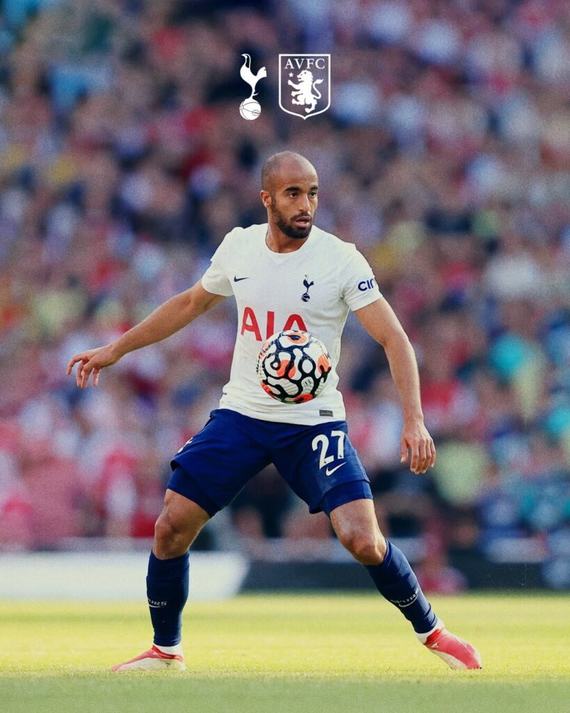
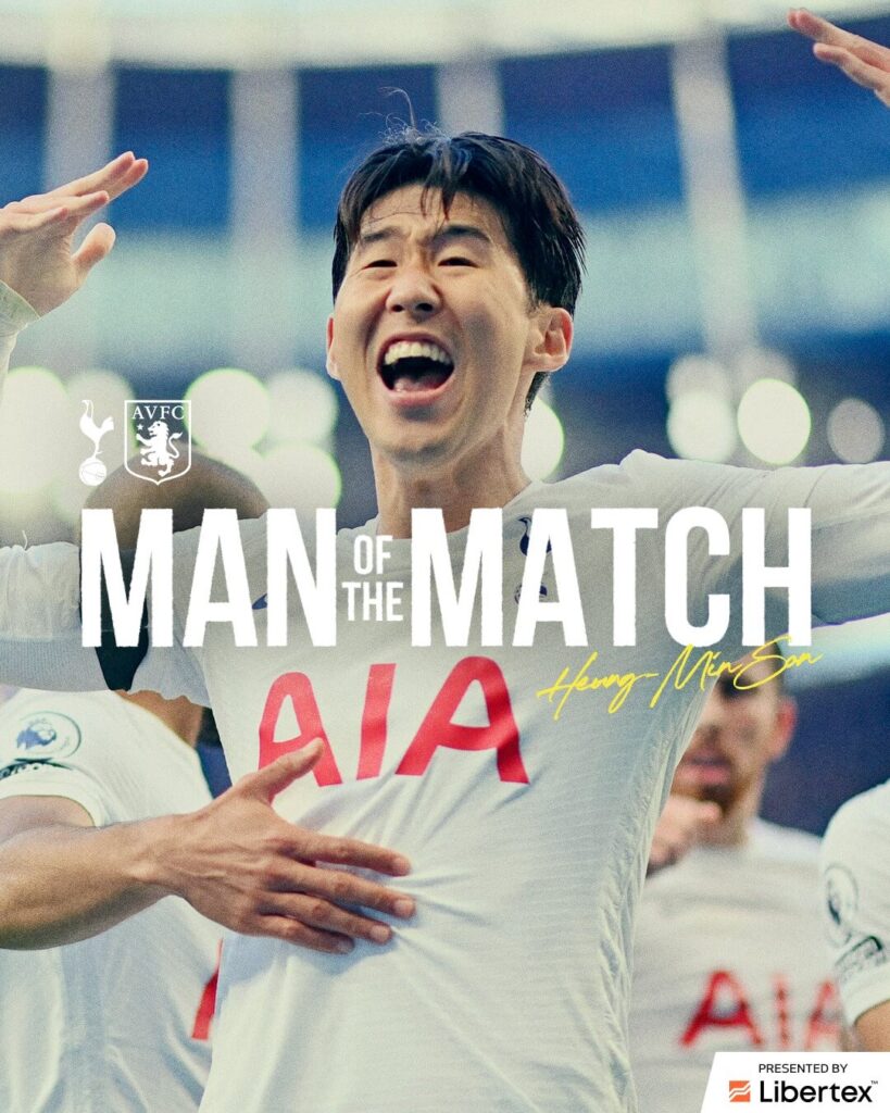
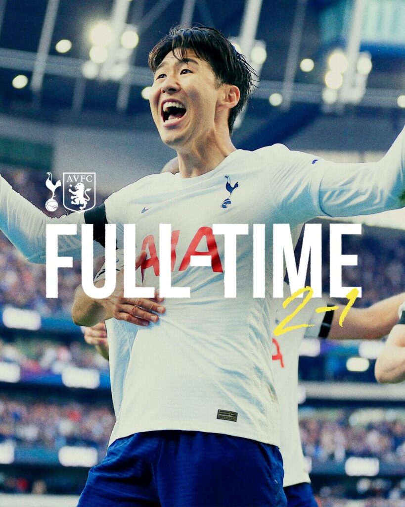
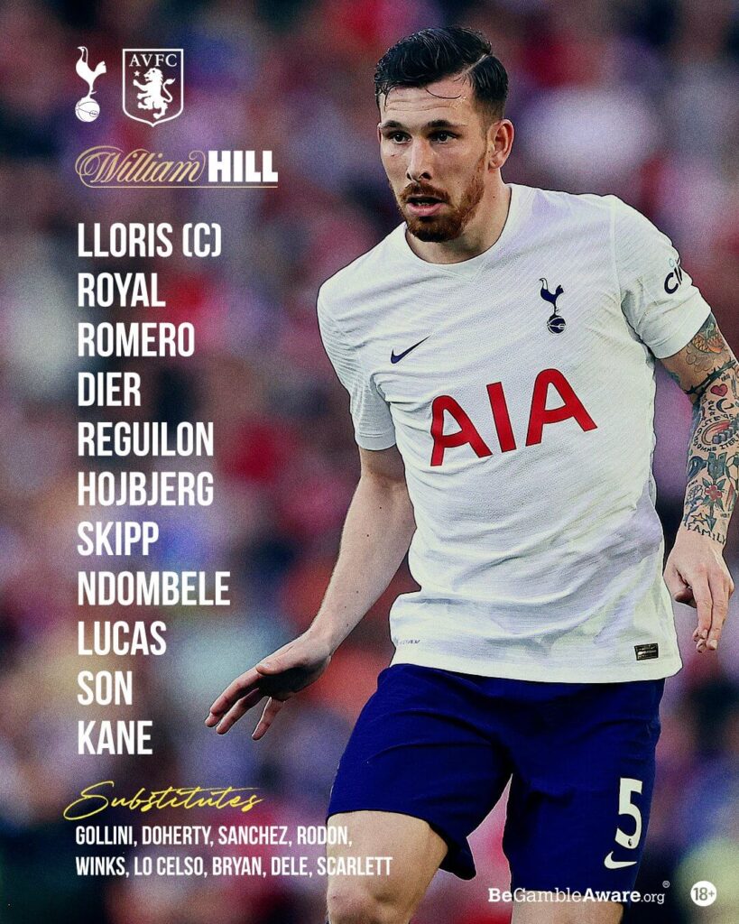
The graphics look neat and to the point with maximum visibility given to the players faces or the players in action. Timing of the events seems to be a miss-out from the visuals whether it is the Match Announcement or the Full Time scorecard.
LUCCASSSS! pic.twitter.com/x2WaT2KXXV
— Tottenham Hotspur (@SpursOfficial) October 3, 2021
Ease of understanding: 4
Brand identity: 3
Creativity: 3
Total = 10/15
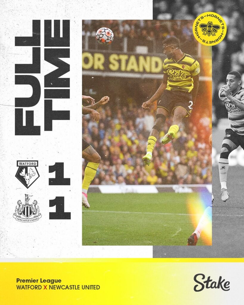
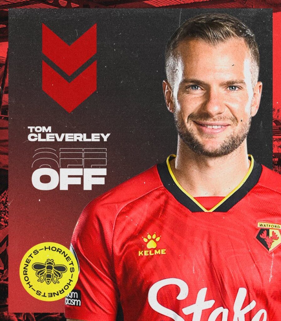
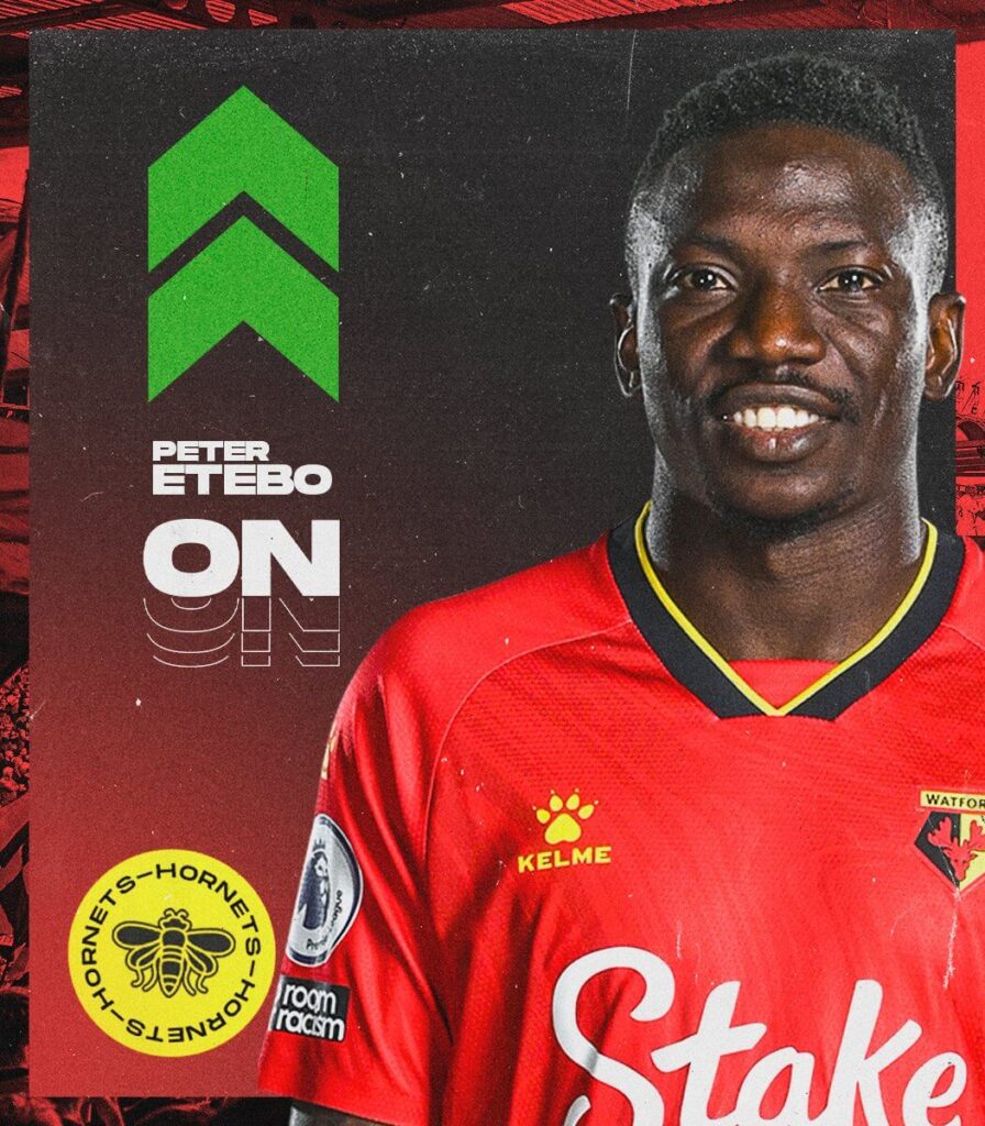
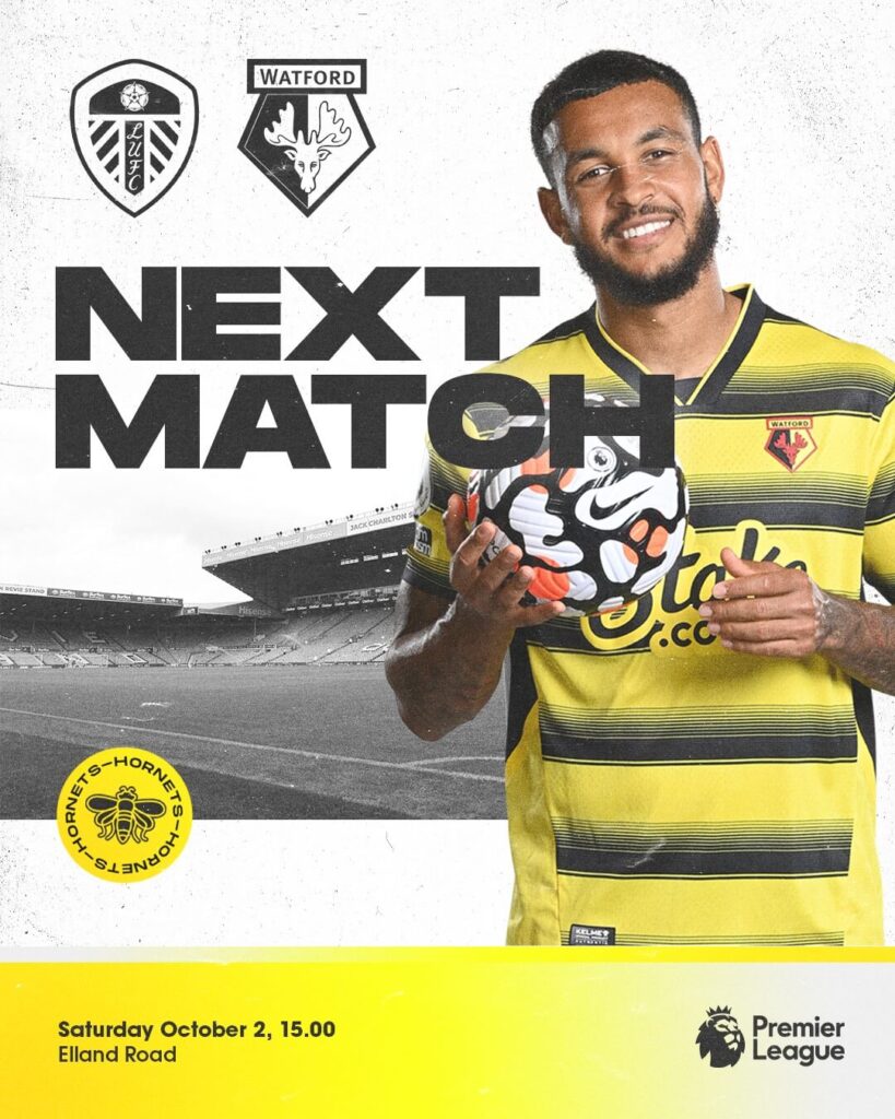
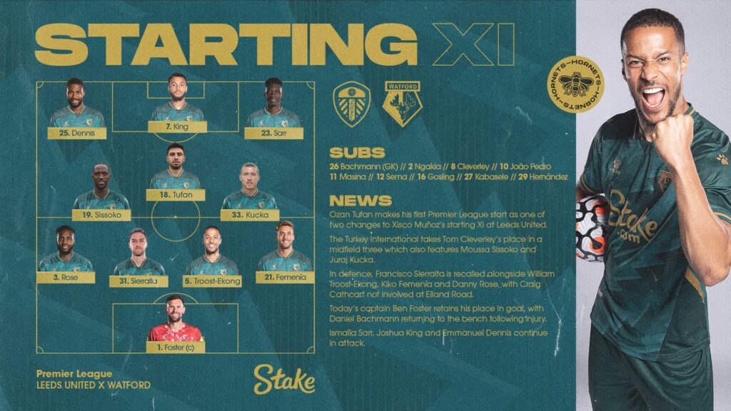
Watford – Matchday Graphics
The black and white theme in the background with a grungy font mixed in with color photographs and graphics in the foreground makes a very unique combination to the Premier League graphics of Watford.
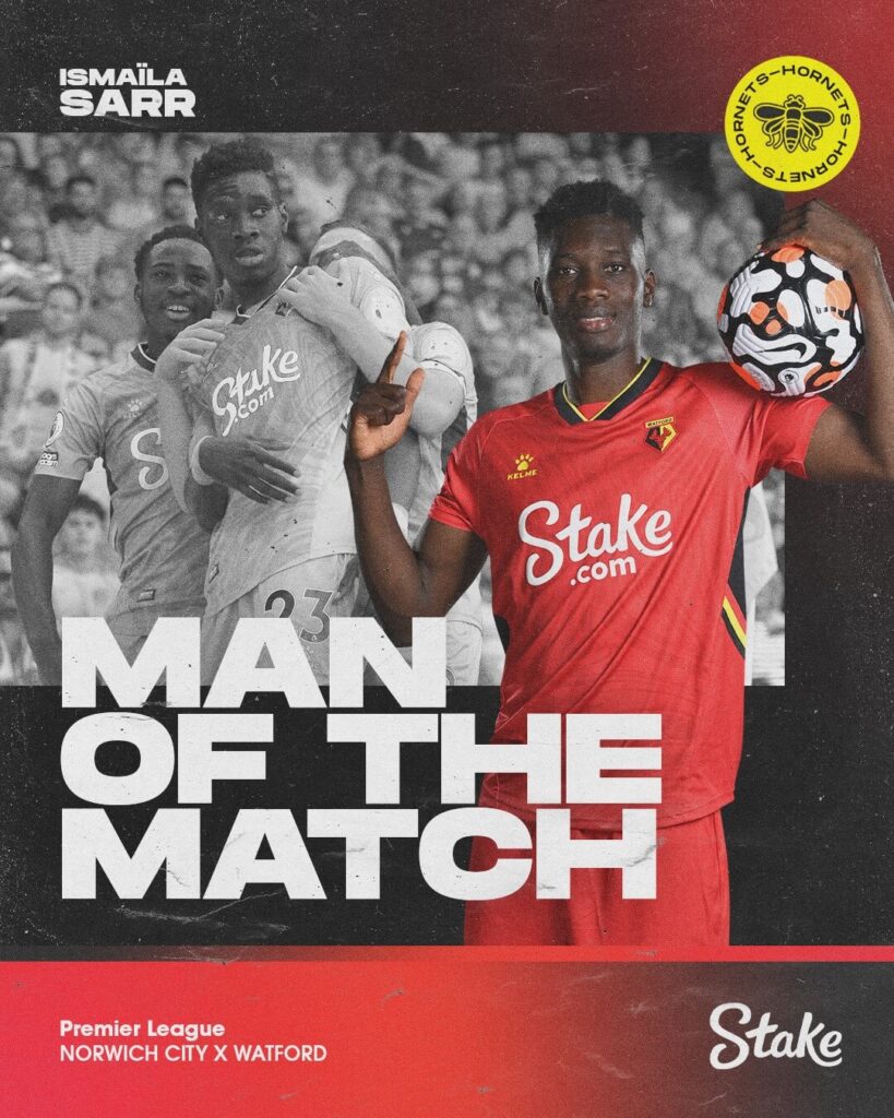
The Lineup visual for the Hornets is arguably one of the best in terms of information with the name, numbers and the formation of the team depicted alongside the team news. However, we must add that the text style used makes it slightly harder to read.
KING!!!!!! pic.twitter.com/VHQZsfgOz9
— Watford Football Club (@WatfordFC) September 25, 2021
Timings are missing from the Watford graphics when it comes to substitutions and the Full time result announcement.
Ease of understanding: 5
Brand identity: 4
Creativity: 4
Total: 13/15
West Ham United – Matchday Graphics
West Ham have opted to use graphics with a tinted feel on parts showing the fans or the stadium. Blue and maroon, their club colors, have been dominant throughout their graphics. The announcements are clear but the Match Announcement post fails to mention the time and date on the graphics.
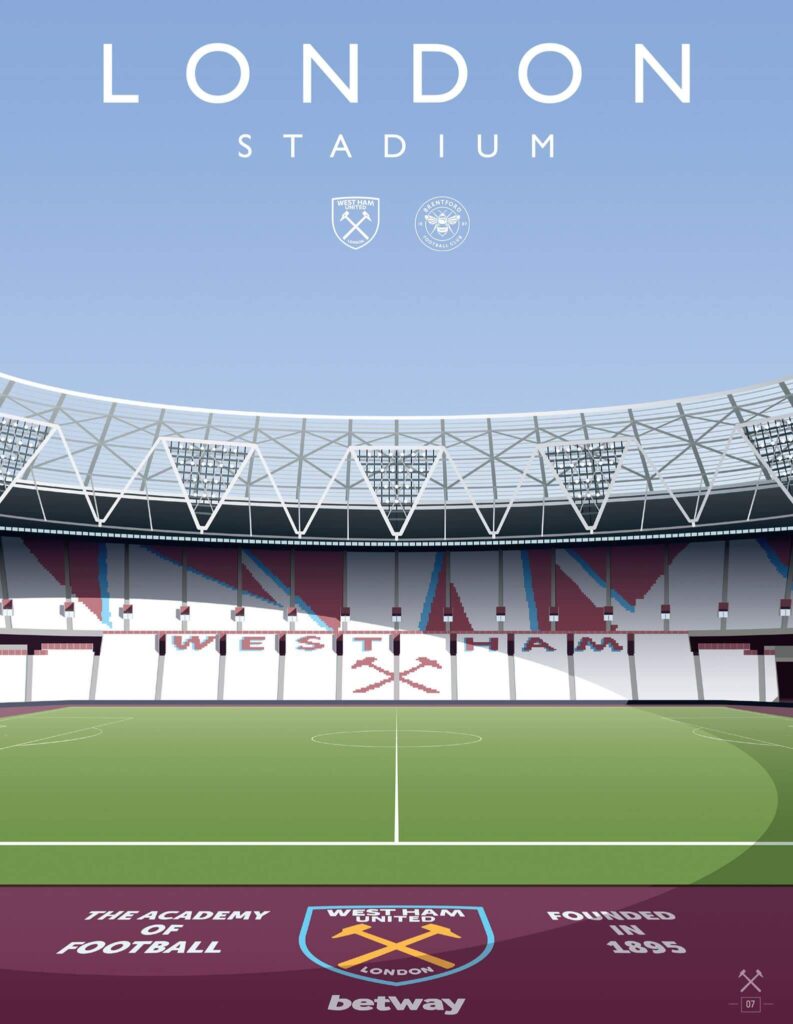
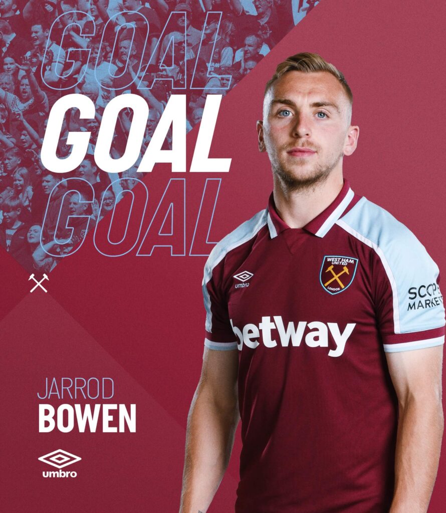
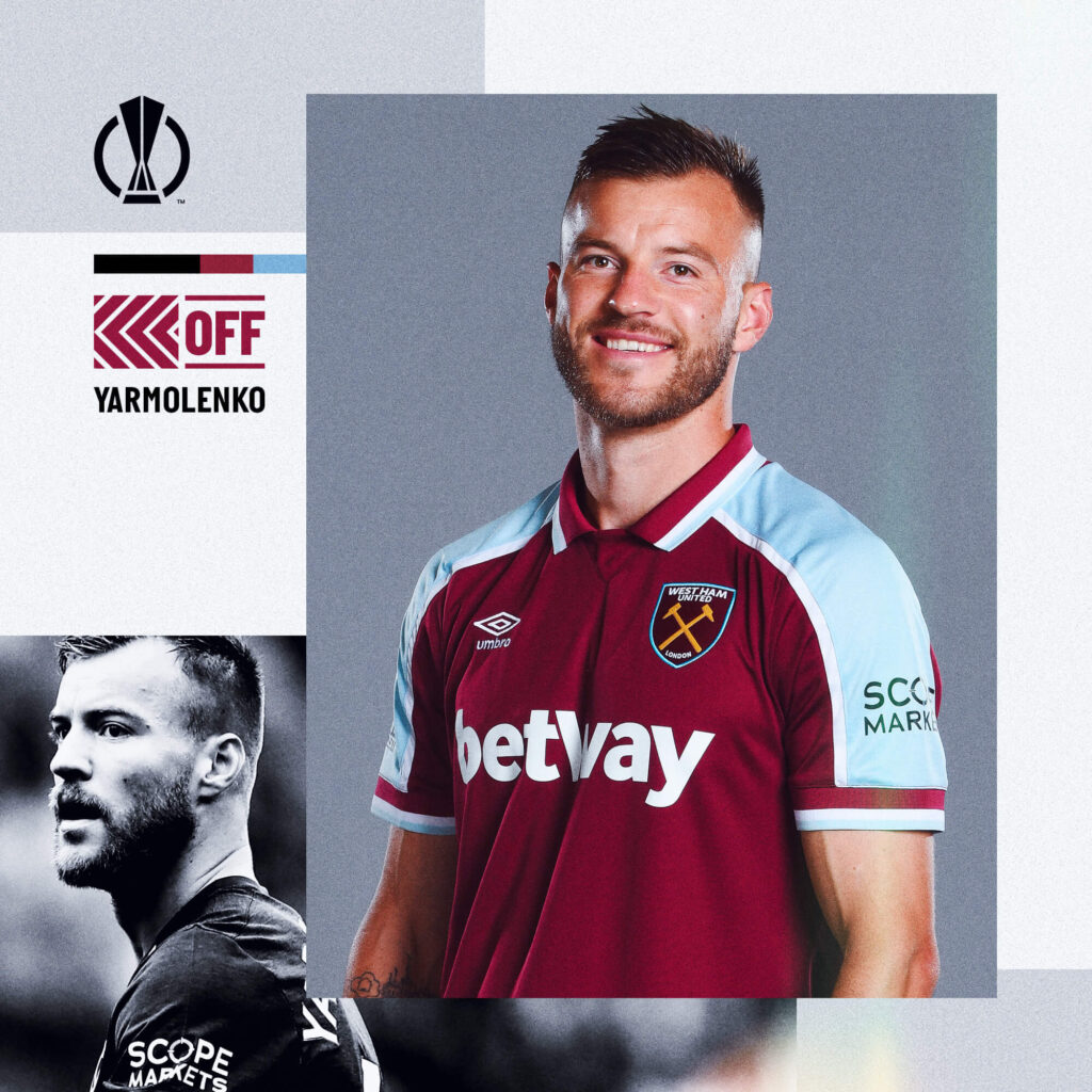
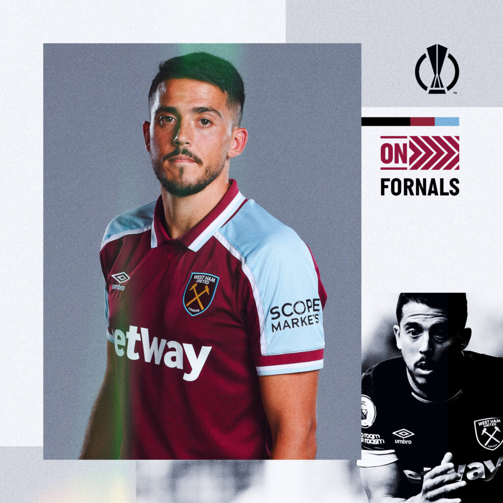
The logos of the clubs used at certain points seem to be less clear because of the sizes used. They could definitely be a little bigger.
Ease of understanding: 4
Brand identity: 5
Creativity: 4
Total: 13/15
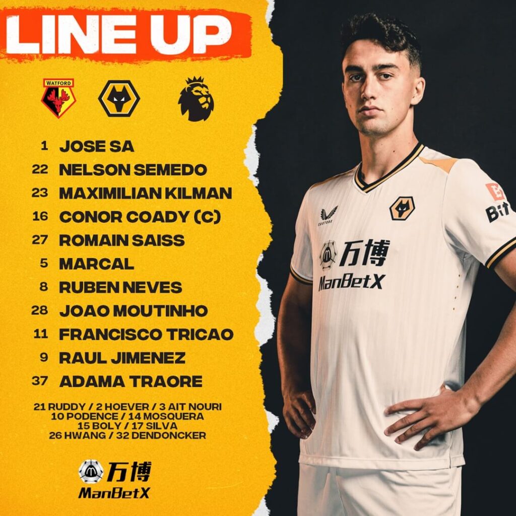
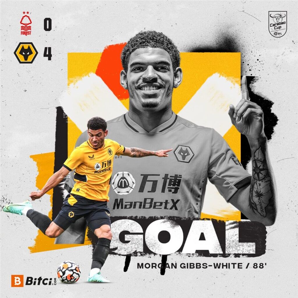
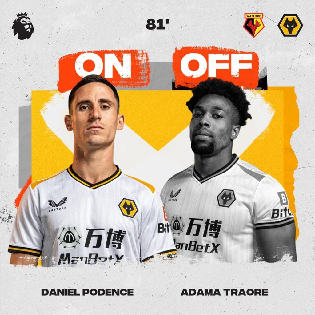
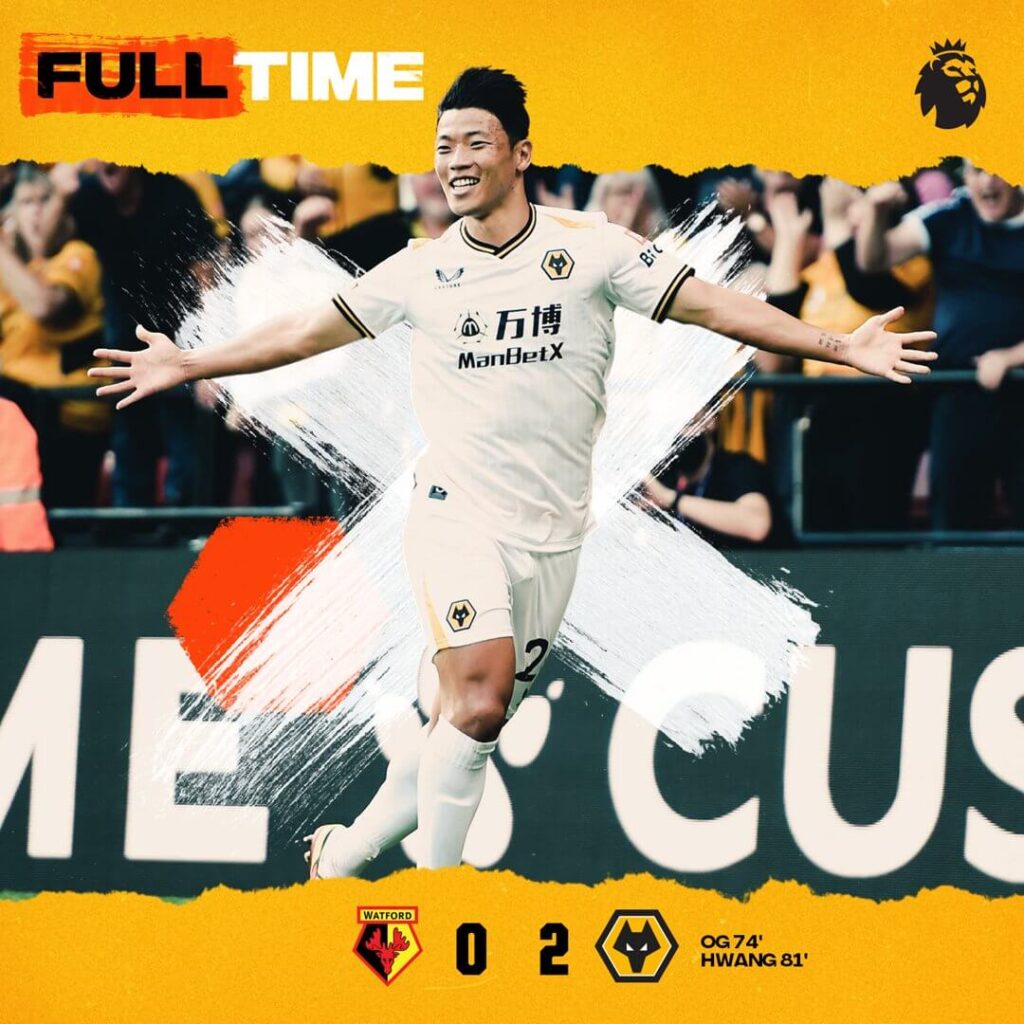
Wolverhampton Wanderers – Matchday Graphics
The Wolves of the Premier League decided to make their matchday graphics with a dominant trait of greys in the background scattered with fine elements and the players in the foreground. Paper cut effect and a hint of spray paint effect are also utilised.
The best thing about the graphics of the Wolves is the mention of the timing of the goals and substitutions on their graphics. This makes it easy for the fans to follow the action.
Wearing white at Watford! ⚪️?
— Wolves (@Wolves) September 11, 2021
? @WatfordFC
? @premierleague
⏱ 3pm#WATWOL pic.twitter.com/OXd1XjZuSu
In terms of what they can improve upon, the goal-scoring images are a little too crowded which can be simplified.
Ease of understanding: 4
Brand identity: 5
Creativity: 4
Total: 13/15
Final thoughts on the Premier League teams and their matchday graphics
The overall analysis of the Premier League matchday graphics paints a beautiful picture. From bright and busy themes to the more subtle black and whites, from the paper-cut effect to the paint-brush effect, a myriad of design ideas and visual identities come to life. Clubs like Norwich, Arsenal and West Ham hit the nail right on the head with their usability, branding and creativity. Other clubs, not too far behind, add their own mix to the Premier League matchday graphics.
We also once again realize through this practice that perfect design is an amalgamation of art and science. The design does not just have to be appealing to view, but should also give the right information in a seamless fashion. The Premier League clubs know their graphics game pretty well.
Create Matchday Graphics with Kickly
To save your time, money and energy, and get the best out of creating content for your matchday we created Kickly – the home of matchday graphics. From your starting lineups, match announcements, to the man of the match, we cover all the bases in a multitude of templates for you so that you can save your time, money and energy, and get the best out of creating content for your matchday.
SIGN UP TODAY and get instant access to 75 free templates that can take your football club’s graphics to the next level.
Contributors: Hassan Azam, Nikola Knezevic.
