The Sports Industry is set to make a comeback like never before in 2021. Given the hiatus of sporting events on an unprecedented scale due to Covid-19, this year is set to be bigger and better than ever before when it comes to sports coverage. Events like the Tokyo Olympics are expected to have more eyes on it than ever before.
This begs a question, how will all that information and coverage be presented? And that is where Kickly comes in. Staying ahead of the curve with sports graphic templates, here at Kickly, we have compiled a list of the latest design trends being followed in the sporting world. Let’s jump right in.
Typography
Bold fonts, combinations bold with same outline fonts
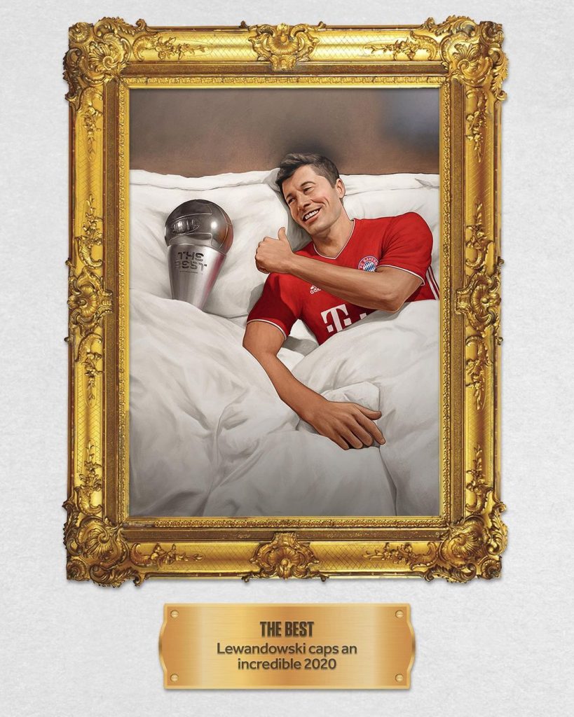
Typography, or the selection of fonts by a sporting company, is a key design element being utilized for better aesthetics today. For instance, Redbull Racing uses bold fonts alongside a combination of bold with just the outline of the font showing to really capture the attention of the user. It’s done to hit the message right home.
Several images of one athlete
One big headshot and several small images of the same person
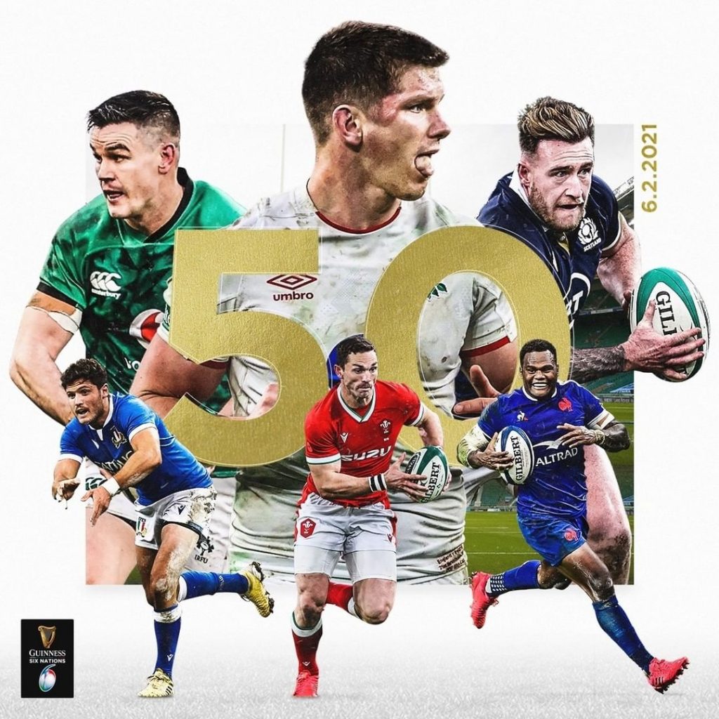
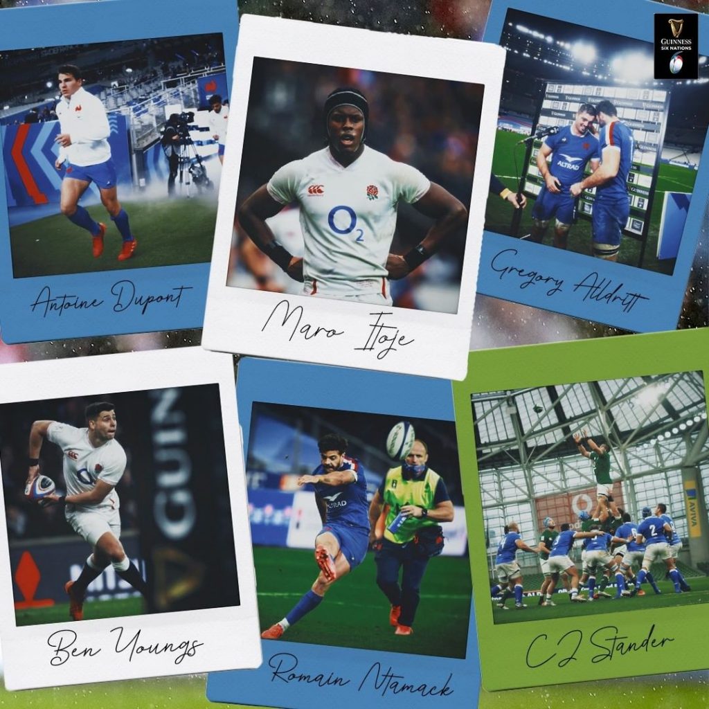
One of the big hits in the sports graphic trends today is that of using a collage of images of the same sportsman while the big headshot takes the spotlight. This trend is being used by several big sporting brands as shown below. The main image is complemented by several others in different actions and size, to give the graphic more detail and depth. Try this one out to get your engagement figures to go up.
Details
Sportsman in strong details, especially the face
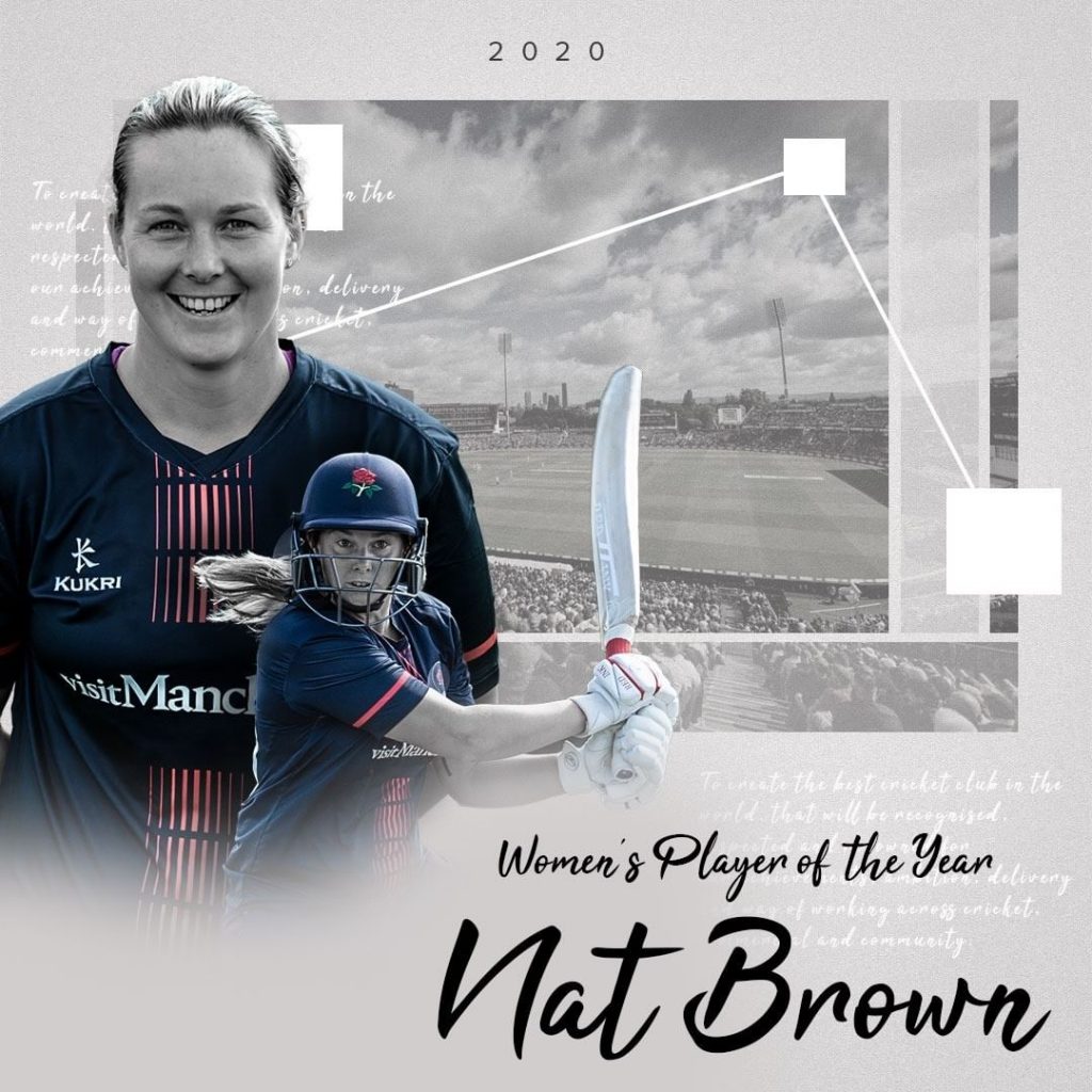
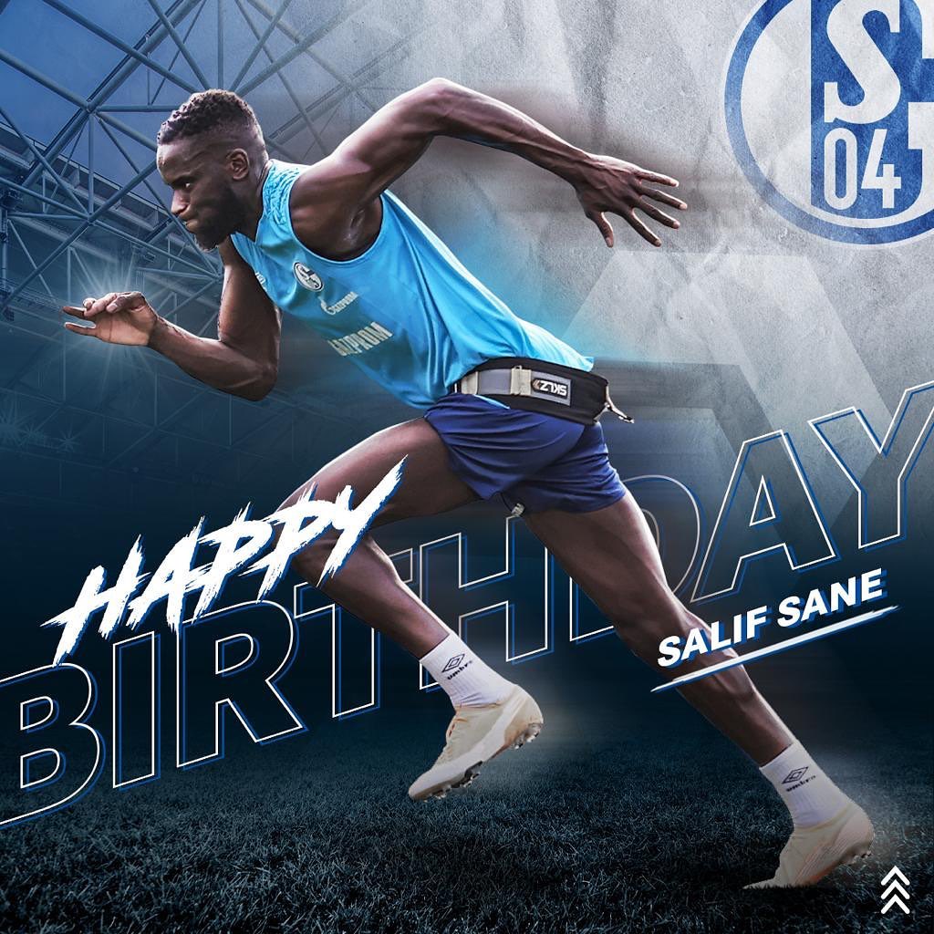
Here is another example of a design trend that the sporting industry is loving these days. A sharp and clear image of the sportsman with design elements spread around him captures the attention right away. It makes sure that the sportsman itself is the center of the focus and the user can quickly identify with the sporting star himself or herself. Now, your audience is ready to take in all the data you want delivered.
Colors
Bright colors, graphics to have overall light feeling
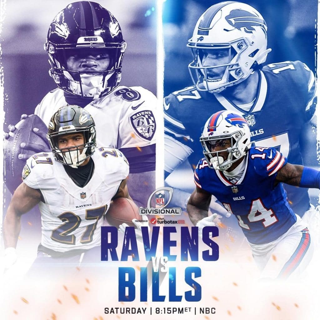
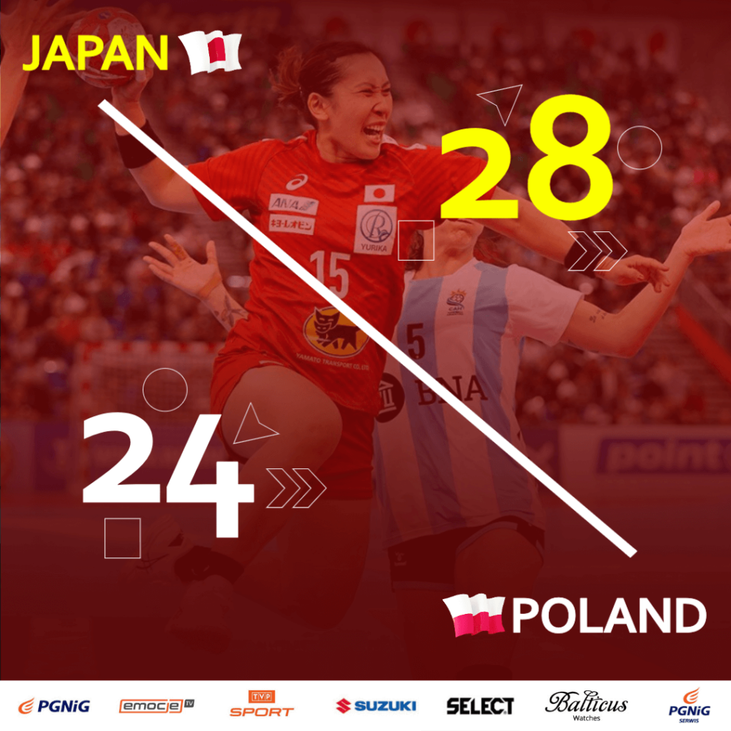
Colors have always been one of the most key elements of sports graphic design, like any other graphics. The current trend by big brands like; Six Nations Rugby and the National Football League of America, showcase how there has been a shift towards keeping the content bright and easy on the eyes. The overall feeling of the sports designs is light and not overbearing on the use of several color tones in one graphic.
Asymmetry
Isn’t necessary to have rules of symmetry on graphic
Yes, we said it. Your sports graphic design does not have to be always symmetrical. Look at this example by the Chicago Bulls of the National Basketball Association in the USA. The player on the left, the game announcement on the right, with plenty of negative space on the bottom right of the design. Asymmetry has its own aesthetic appeal and gives for a fresh look.
Background
To be overcrowded with many elements
Deciding what the background for your sports graphic is going to look like is a key part of the process. Modern trends are making a shift towards a busy background with several elements dominating that space. This technique also helps bring your foreground into focus right away, which is where your sportsman thrives. Whether its splatter effect or a jam packed stadium, a busy background gives more personality and depth to your graphic.
Retro vibe
Retro is the new normal
Even the sports design world is a cycle, much like the fashion industry, there are just certain design traits that never really go out of fashion. Retro designs are one of them. Whether it’s taking inspiration from Game of Thrones or the Mona Lisa, retro designs have made a huge comeback into the mainstream, boosting engagement and interactions.

instagram.com/sixnationsrugby 
instagram.com/brfootball
Geometric shapes
Using your everyday shapes
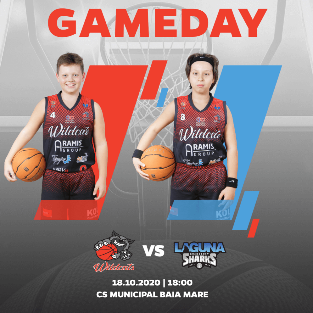
Whilst innovation and ingenuity are at the forefront of modern sports design trends, the basics can never be underestimated in terms of their visual beauty. Geometric shapes, such as the square, circle, and triangle, to name a few, are being spread over and utilized the world over to create compelling artwork.

Template available on app.kickly.net 
There are loads of other design trends in the sports industry which could catapult your design strategy toward creating stunning visuals. We listed a few to inspire and motivate you. At Kickly, we embrace all the above-mentioned trends in our templates to give your graphics that cutting edge they need. Sign up and start creating sports designs that your fans will love.
Contributors: Nikola Knezevic

