For any sporting club, matchdays are arguably amongst the busiest days in the calendar year. From match announcements, team news, live updates, to so much more, fans are glued to the social media of their favorite teams to stay connected, informed and enthralled.
As a sporting club, you should be looking to maximize the potential of these engagements by creating matchday graphics in the optimum manner. What is that you ask? Here is your complete guide.
Jump to:
Matchday Announcement
Lineup
Goal card
Substitutions
Half-time, Full-time result
Man of the Match
The Home of Matchday Graphics
Matchday Announcement
Announcing the matchday is one of the most crucial posts on your checklist. It should not only announce who the match is against, where it is going to be played, and when, but also have a clean graphic for users to easily perceive that information.
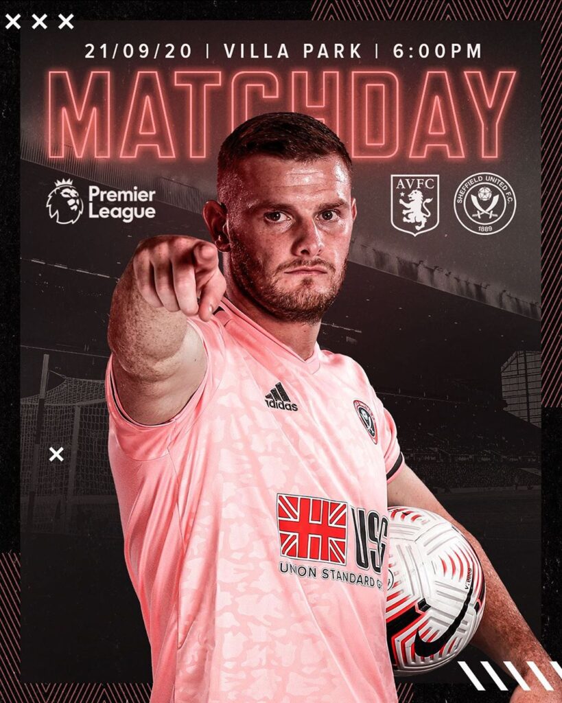
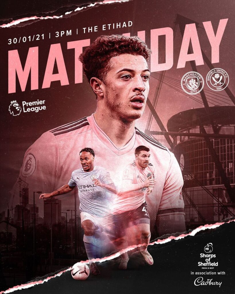
The most common way to do that is by using different players on the post for announcing the matchday. Another match, another player for the graphic and so on. Sheffield United FC does something similar as the examples below depicts. Using this strategy means you don’t repeat a player anytime soon and keep the graphics interesting.
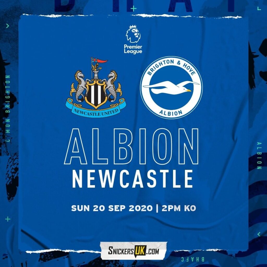
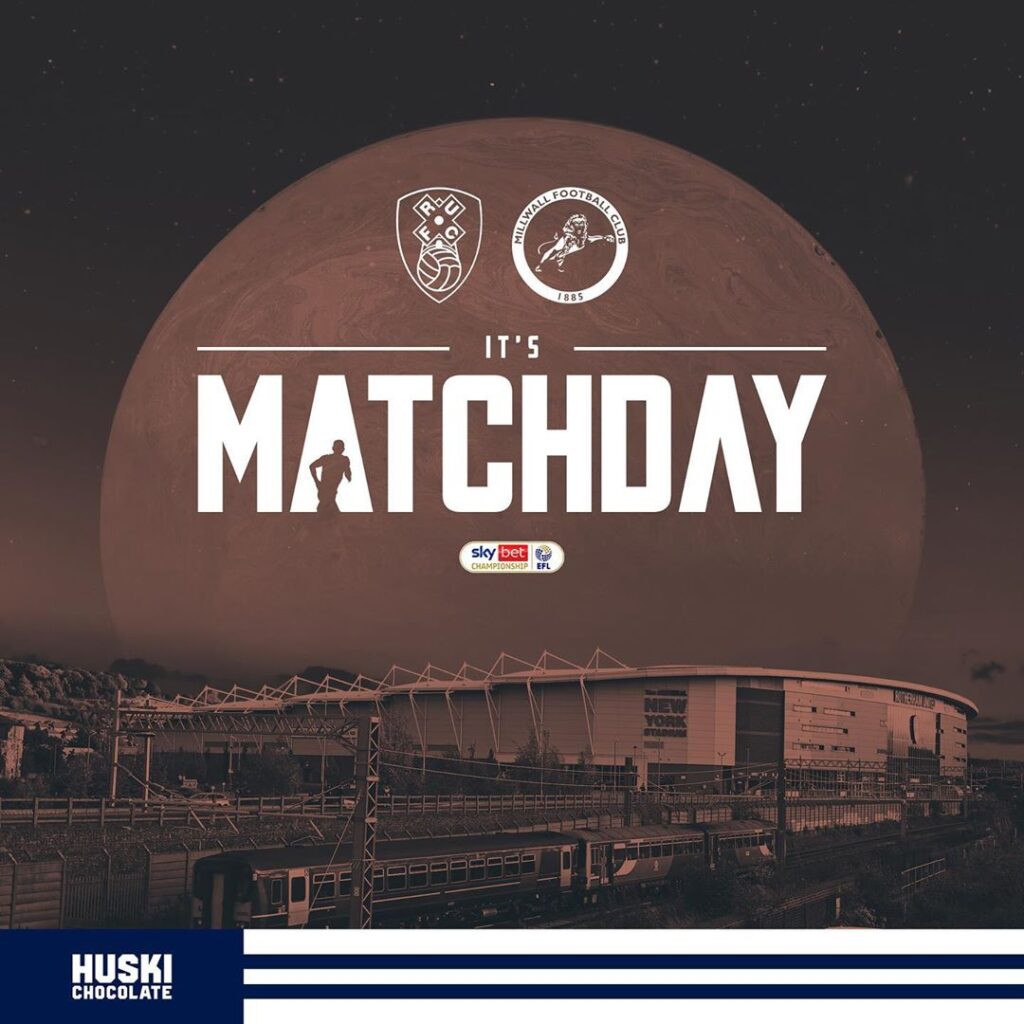
In case players are not your way to go, there are other ways to announcing the matchday as shown below:
➔ Just using illustrations as Brighton & Hove Albion FC have done.
➔ The picture of the club stadium or the city can be used in the background as shown in the second example.
⚠ Also remember, it is highly recommended to announce the matchday early morning on the game day itself to allow the fans to get themselves geared up for the game. The ideal time would be when your fans become the most active on matchday mornings.
Lineup
The team lineup is one of the most key posts when it comes to creating matchday graphics. The lifespan of this post is pretty short – less than 1 hour, so you have to bear in mind that the fans should get the information quickly and easily. That’s why a clean structure is more than welcome.
There are two ways of presenting players – only text or text plus players’ photos.
Only Text Lineup
Here is a great example of how to use just the text and have a fantastic post revealing the lineup of the team. The design by Chelsea is clean and crisp. The fonts used are clear and easy to read, and the color scheme, background design and the gradients used go excellently with the clubs branding and image. Having said that, we at Kickly believe there can be still more to it.
Chelsea team to play Arsenal… #ARSCHE pic.twitter.com/5ksZ7yucqx
— Chelsea FC (@ChelseaFC) January 19, 2019
So, for the ideal team lineup post, here is the information you must include to cover all your bases. Your graphic must include:
✅ Opponent’s name or logo
✅ Player names and numbers
✅ Players must follow a certain order, according to the tactical scheme
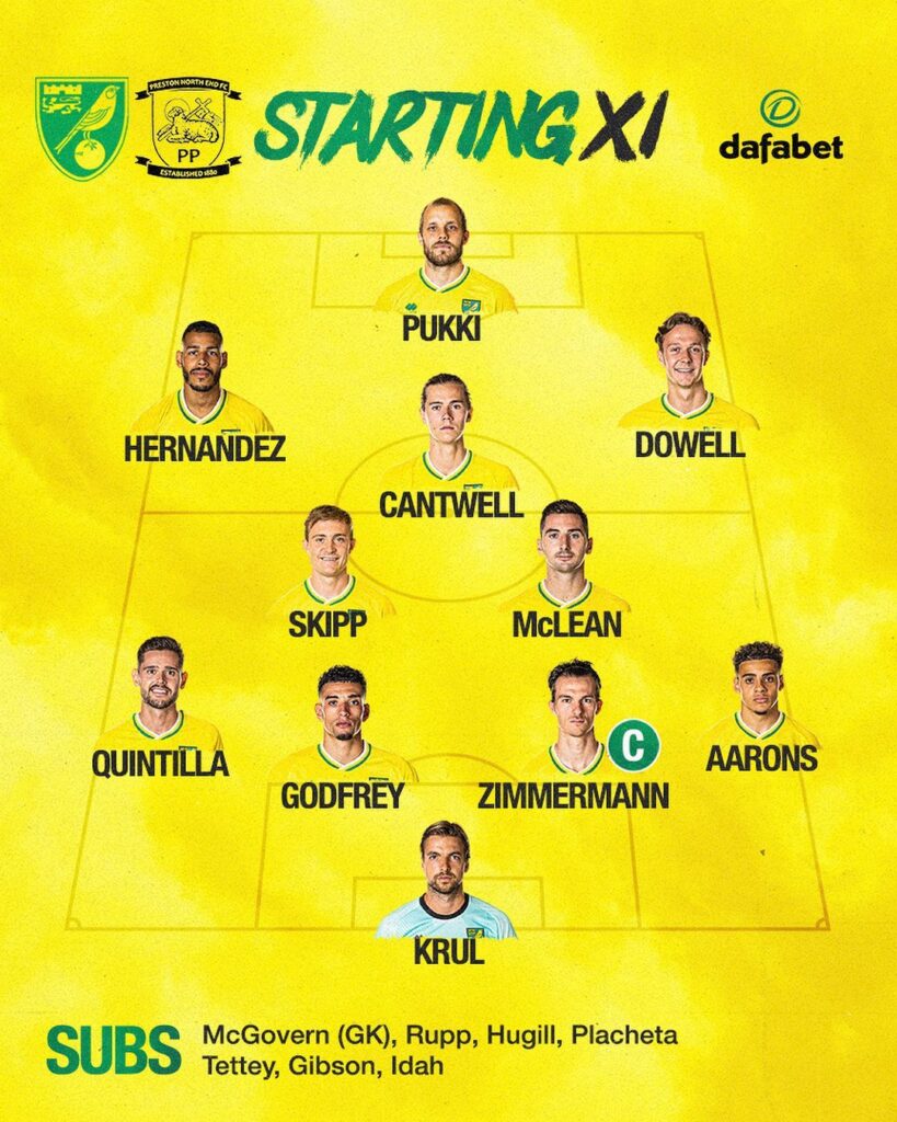
Text + Players Photos Lineup
Here is an example of how Norwich City announced their lineup against one of their opponents. The players have their photos with their names at the bottom. It is a clean design, all the players’ names and positions on the fields have been identified alongside their pictures. The substitute list is also included. It is a job well done overall.
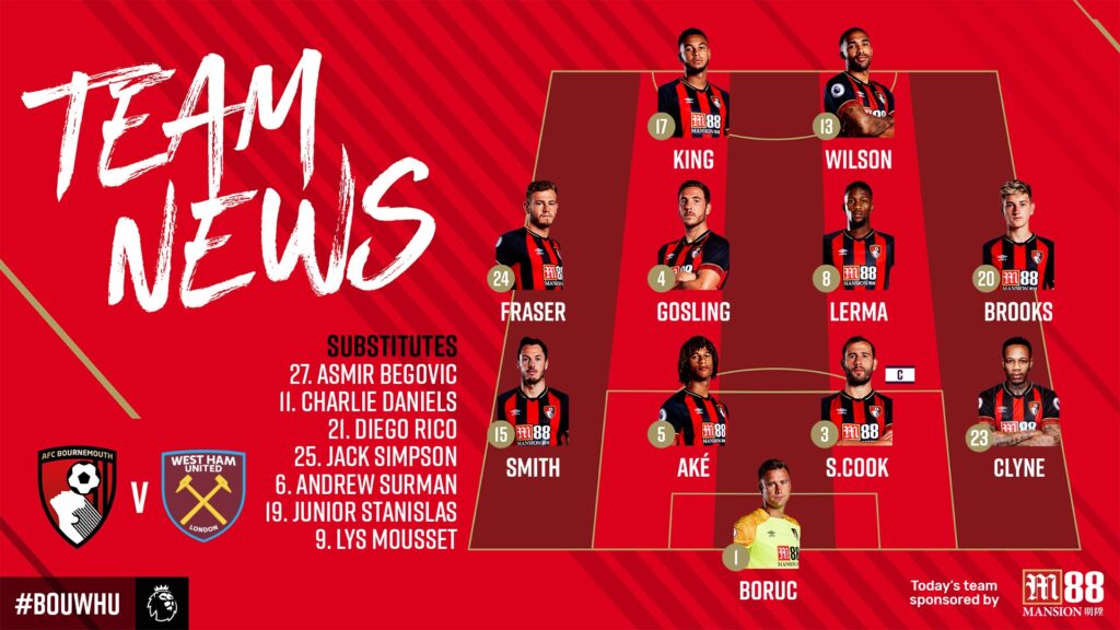
AFC Bournemouth have done an excellent job with their team lineups as well. Not only have they put out the formation their team would play the match with, they also included the players number, names, their opponents, and their substitutes available for the game. Overall, they hit the nail right on the head.
Goal card
What is football if not an update on who has scored how many goals. That is what decides the result in the end, right?! So, it can be said that this is the graphic which the fans await the most during any football match.
Here is how Juventus do it. Since the announcement of a goal is time-relevant, they showcase their goal-scorer, Ronaldo, using a premade graphic video and then give the details in the text. The time of the goal scored, the goal scorer, and the current score are all pivotal points covered in this tweet.
10’ | ? | SIIIIIIII!!!!!!! #CR7AIRLINES TAKES OFF TO GIVE US AN EARLY LEAD!!!!!!!! ✈️⚽️#CagliariJuve [0-1] #ForzaJuve@officialpes pic.twitter.com/pdIOR1YNUy
— JuventusFC (@juventusfcen) March 14, 2021
⚠ When you create your matchday graphics, you should have all the possible posts for goal-scorers lined up and ready to go. And, most importantly, for the goal scoring posts a short video format is recommended.
Substitutions
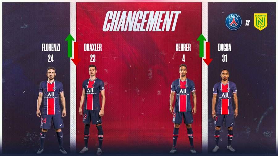
Substitutions are a vital part of any match but as a matchday graphic, they are optional. It is time relevant, so as the graphics should be ready to go, with only a few minor edits. You should have the following information to cover everything needed:
✅ Number and picture of the player coming off (red arrow indicating the player going off)
✅ Number and picture of the player coming in (green arrow indicating the player coming in)
✅ The logo of your club and the logo of the club the match is against
✅ The time of the substitutions, which can be a part of the text of your tweet or post.
PSG hits the point right home with the following graphic covering all that they needed:
⚠ This type of graphics are only recommended to be posted on Twitter (as it’s a live platform) and as stories on Instagram or Facebook. It is not recommended to be posted as regular posts on Facebook, Instagram or other platforms.
Half-time, Full-time result
Half-time & Full-time graphics are important for users to stay connected with the result of the game. Ideally, at the half way stage and the full-time, you create a matchday graphic which includes a relevant picture from the match, the score-line and the goal scorers with their relevant timings mentioned.
It sounds easy but sometimes small factors can be overlooked. Here is a tweet from Real Madrid in which they announce the fulltime score with Banzema in the background, a goal scorer in the match, without mentioning who scored when.
? FP: @realmadrid 2-1 @elchecf
— Real Madrid C.F. (@realmadrid) March 13, 2021
⚽ @Benzema 73′, 90’+1′; Dani Calvo 61′#Emirates | #HalaMadrid pic.twitter.com/SDN5xAji0T
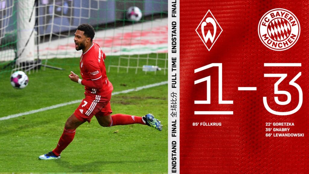
The perfect example would be that of Bayern Munich, who not only included a picture from the match showing Gnabry (one of the goal scorers), they also showed who scored and when for both teams underneath the final result. The design is clean, clear and beautifully conceptualized in the colors of the club.
The important points to note are:
✅ If possible, include a photo with a key moment in the game (the goalscorer would be ideal).
✅ If you have a photo in real-time – lay more focus on it. Don’t add too many elements to lose the focus from the picture.
✅ Make sure “Half time” or “Full time” is clearly visible on the graphic.
MVP / Man of the Match (MOTM)
The most valuable player of the team or the man of the match is a great way to connect the assets of your team with your fans and engage after the game has been finished. It is also a public appreciation of your best player of the day, which must help considerably in boosting the confidence of the player as well.
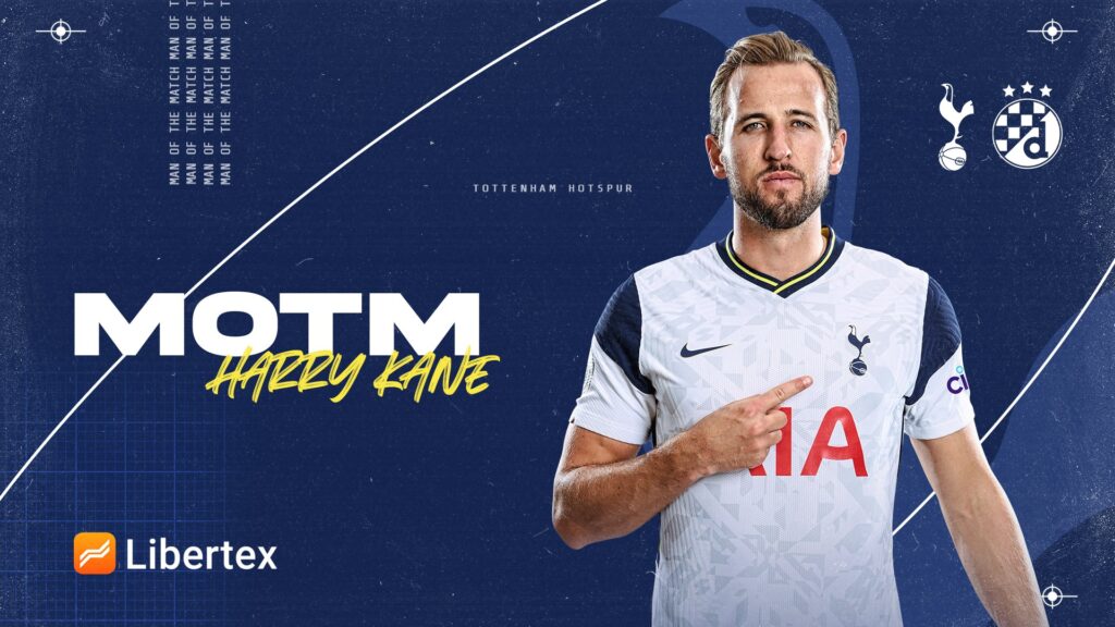
The keys for this one are simple, have the players picture & name, the match logos of your club and the opponents and a text mentioning that the particular player is the man of the match. Spurs did exactly that when announcing Harry Kane as their MOTM.
Here is another good example of the MOTM. Fulham mention the players name and the name of their rivals in the match with a clean white graphic including minor elements for details.
A great big wall. ??
— Fulham Football Club (@FulhamFC) March 8, 2021
It’s Joa taking the #LIVFUL MOTM! ? pic.twitter.com/asiVf6OgqW
⚠ MOTM graphic is a perfect opportunity to bring your sponsor in and announce your man of the match through their brand’s presence in your post.
Kickly – The Home of Matchday Graphics
Here at Kickly, we live and breathe sports graphics all day. Especially the matchday graphics. From your starting lineups, match announcements, to the man of the match, we cover all the bases in a multitude of designs for you so that you can save your time, money and energy, and get the best out of creating content for your matchday.
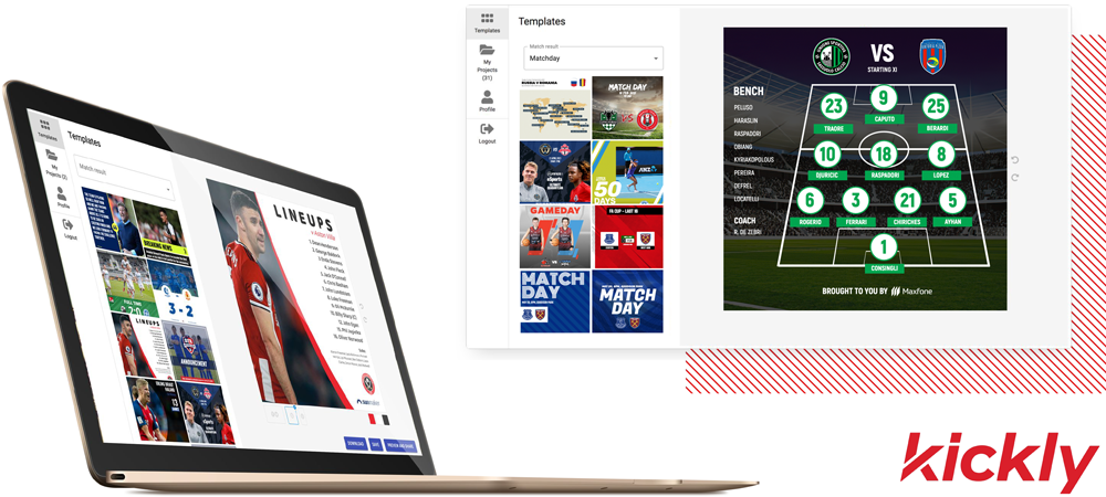
⚠ Not sure how it all might be?! How about a free trial with all the features you would love. Click here for more details.
We shared our list of the key points on mastering the creation of matchday graphics. Taking care of minor details, being ready in advance, and most importantly; knowing what information to cover under which campaign, will lead to stunning visuals, more engagement and happier fans. You can of course add to this must-haves list, but make sure not to miss out on any of the key points.

